Every business owner can spot a bad website when it belongs to someone else. The menu that leads nowhere, the page that takes an age to load, the phone number buried three clicks deep. Spotting the same problems on your own site is much harder, because you know where everything is, you’ve stopped noticing the wait, and your visitors don’t report a bad experience. They just leave.
A good website answers a visitor’s questions within seconds, earns their trust, and makes it effortless to get in touch.
As winners of ‘Standout B2C Website of the Year’ at the 2026 UK Digital Excellence Awards, our team knows what it takes to create an effective website.
In this blog, we’ll break down the key elements that we include in our award-winning websites, with examples and checks you can run on your own site today.
- What makes a good website?
- The quick website checklist
- How does your website measure up?
- What makes a good website: FAQs
What makes a good website?
1. A clear answer to three questions
Within seconds of landing on your homepage, a visitor should know what you do, where you do it, and how to contact you. That sounds obvious, and it’s also the most commonly failed test in small business web design.
A roofing company in Sheffield whose homepage says “Quality solutions for every project” has told the visitor nothing. One whose homepage says “Roof repairs and replacements across Sheffield and South Yorkshire” with a phone number in the header has answered all three questions before anyone’s scrolled.
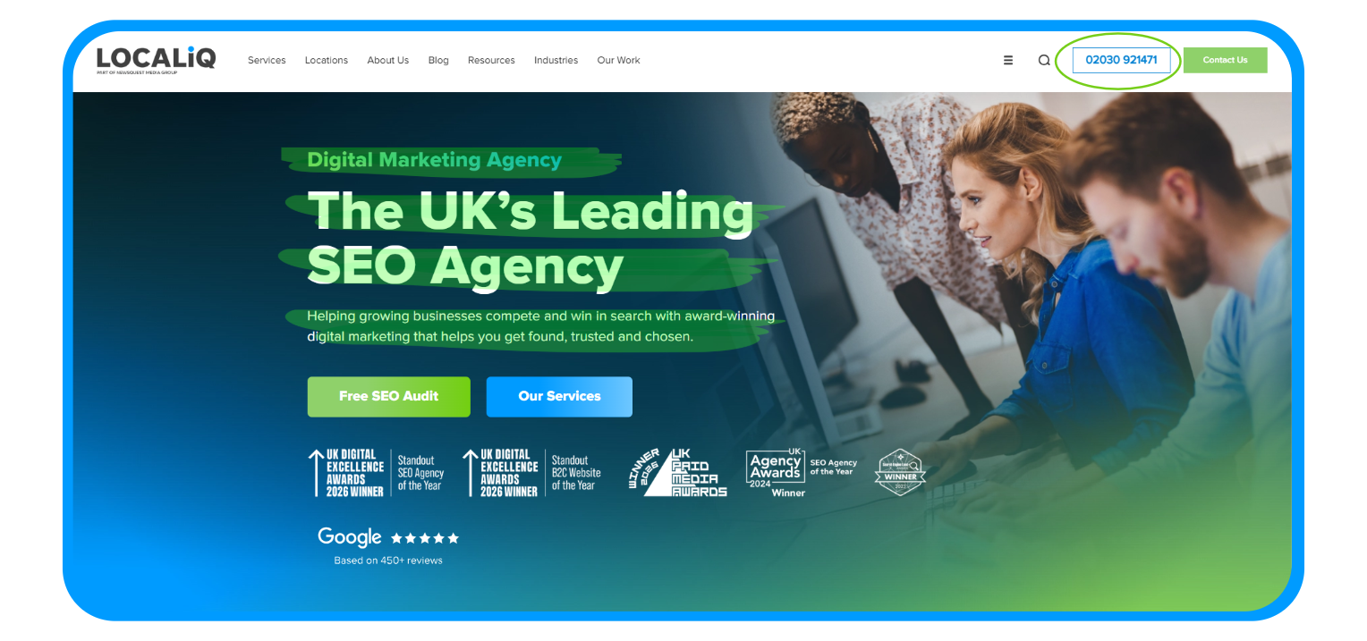
For example, on our home page we made sure the services we offer are clear immediately. We also provided multiple ways to contact us, including a phone number and a contact us button.
Check your own site: Open your homepage and give yourself five seconds. Would a stranger know what you do, where you operate, and how to reach you? If any of those takes scrolling or clicking to find, that’s the first thing to fix.
2. Mobile-first design
The majority of UK web traffic is mobile, and for local searches (“plumber near me,” “dentist open Saturday”) it’s higher still. If your website works beautifully on a desktop and awkwardly on a phone, it’s failing most of your visitors.
Mobile-first means more than the site technically loading on a phone. Buttons need to be big enough to tap without zooming. Forms need to be short enough to complete with thumbs. Phone numbers need to be tappable, not just displayed. Menus need to work without precision clicking..
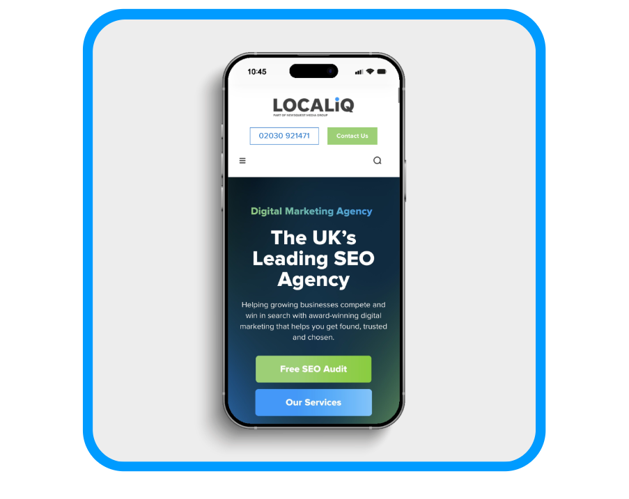
With our website, we ensured all the key components were still viewable (logo, what we offer and contact button), but made the navigation menu easier to access and browse on a mobile device. We also made sure the CTAs were bigger, so they were easier to click on from a smaller device.
Check your own site: Pick up your phone and try to complete the action you most want customers to take, booking, calling, or filling in a form. Count the taps and note every point of friction. Anything that annoys you is losing you enquiries.
3. Speed
Google’s research shows that as page load time goes from one second to three seconds, the probability of a visitor bouncing increases by 32%. From one to five seconds, it jumps by 90%. Speed is one of the clearest examples of a website problem that’s invisible to the business and obvious to the customer.
The usual culprits are large uncompressed images, bloated themes and plugins, cheap hosting, and videos set to autoplay. None of these look like problems from the inside, because you built the site and you’re used to waiting for it.
Check your own site: Run your homepage through Google’s PageSpeed Insights. It’s free, takes seconds, and tells you exactly what’s slowing your site down on both mobile and desktop. Aim for a load time under three seconds. If your score is in the red, image compression is usually the fastest win.
4. Navigation that doesn’t make people think
Good navigation is invisible, because visitors find what they need without noticing how. Bad navigation is the restaurant website where the menu is a PDF that takes three taps to open and doesn’t fit a phone screen.
The rules are simple and widely ignored:
- Try to keep your top-level menu items to less than 10
- Descriptive labels: “Services” beats “What We Do,” “Contact” beats “Let’s Connect”
- Your most important pages one click from the homepage
- A visible search bar if your site has more than 20 or so pages
Check your own site: Ask someone who’s never seen your website to find a specific service and your contact details. Watch where they hesitate. Those hesitations are where customers give up.
5. Design and branding that builds recognition
Visitors form an impression of your website in a fraction of a second, well before they’ve read a word. Consistent colours, consistent fonts, and a layout that gives content room to breathe all signal professionalism before you’ve said anything.
The single biggest design upgrade most small business websites can make costs nothing: replacing generic stock photography with real photos. Real photos of your team, premises and work build trust that stock images of smiling models in headsets never will. Customers can spot stock photography instantly, and it tells them nothing about you.
Check your own site: Count how many images on your homepage are of your real business. If the answer is none, that’s a straightforward improvement worth making this month.
6. Copy that answers real questions
Good website copy is structured, scannable and written for the customer rather than the business. That means a clear heading hierarchy (one H1 per page, logical H2s and H3s beneath it), short paragraphs, and content that addresses what customers want to know rather than what the business wants to say.
The difference in practice: “We are a leading provider of comprehensive property solutions” tells the customer nothing. “We manage lettings for landlords across Manchester, from finding tenants to handling repairs” answers a real question.
Customers arrive wondering “do you cover my area,” “how much does this cost” and “how quickly can you start.” Copy that answers those questions converts. Copy about a passion for excellence doesn’t.
7. Trust signals
Before a customer contacts a business they’ve never used, they look for evidence that it’s legitimate and good at what it does. A good website puts that evidence where visitors will see it:
- Reviews and testimonials, ideally with names, locations and specifics rather than anonymous praise
- Case studies showing real work for real customers
- A proper About page with real people, real faces and a real story
- Full contact details, including a physical address and phone number, not just a contact form
- Accreditations, memberships and awards relevant to your industry
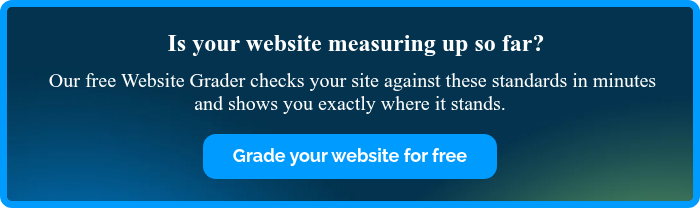
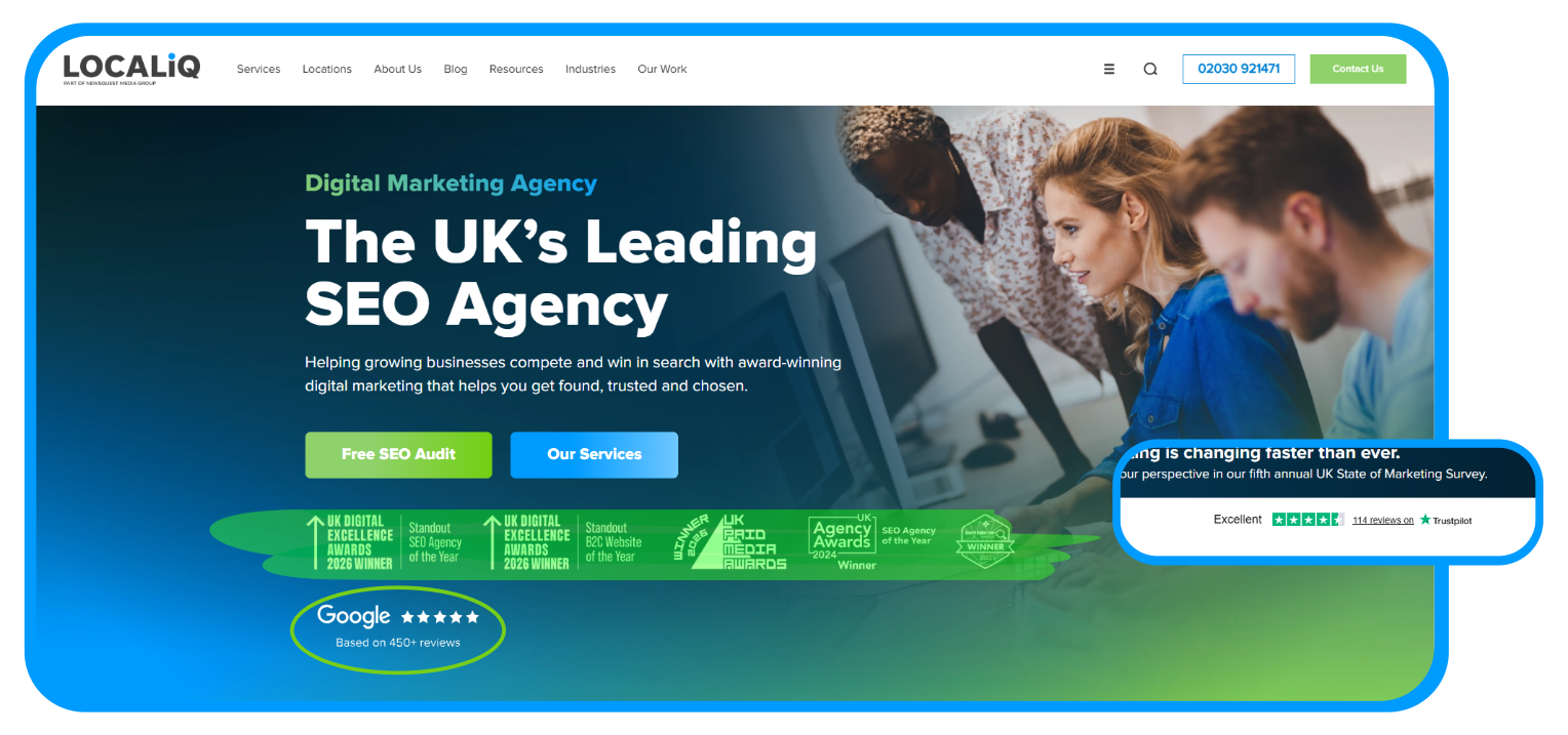
When designing our website, we made sure our award wins were immediately visible. We also included our Trustpilot score on our home page. Having a decent Trustpilot score confirms that a business is real, active and provides a high-quality service:
Check your own site: Look at your homepage as a stranger would. What evidence is there, above the fold, that you’re good at what you do?
8. Calls to action that give visitors a next step
Every page on your website should make it obvious what the visitor should do next. Book a consultation, request a quote, call now, view our work. When a page has no call to action, visitors read, run out of page, and leave.
The essentials:
- Action language: “Get your free quote” beats “Submit”
- Visual contrast: the button should stand out from everything around it
- Placement on every page: including blog posts, service pages and the About page, because visitors don’t only convert from the homepage
- One primary action per page: a page asking visitors to call, email, book, subscribe and follow all at once tends to achieve none of them
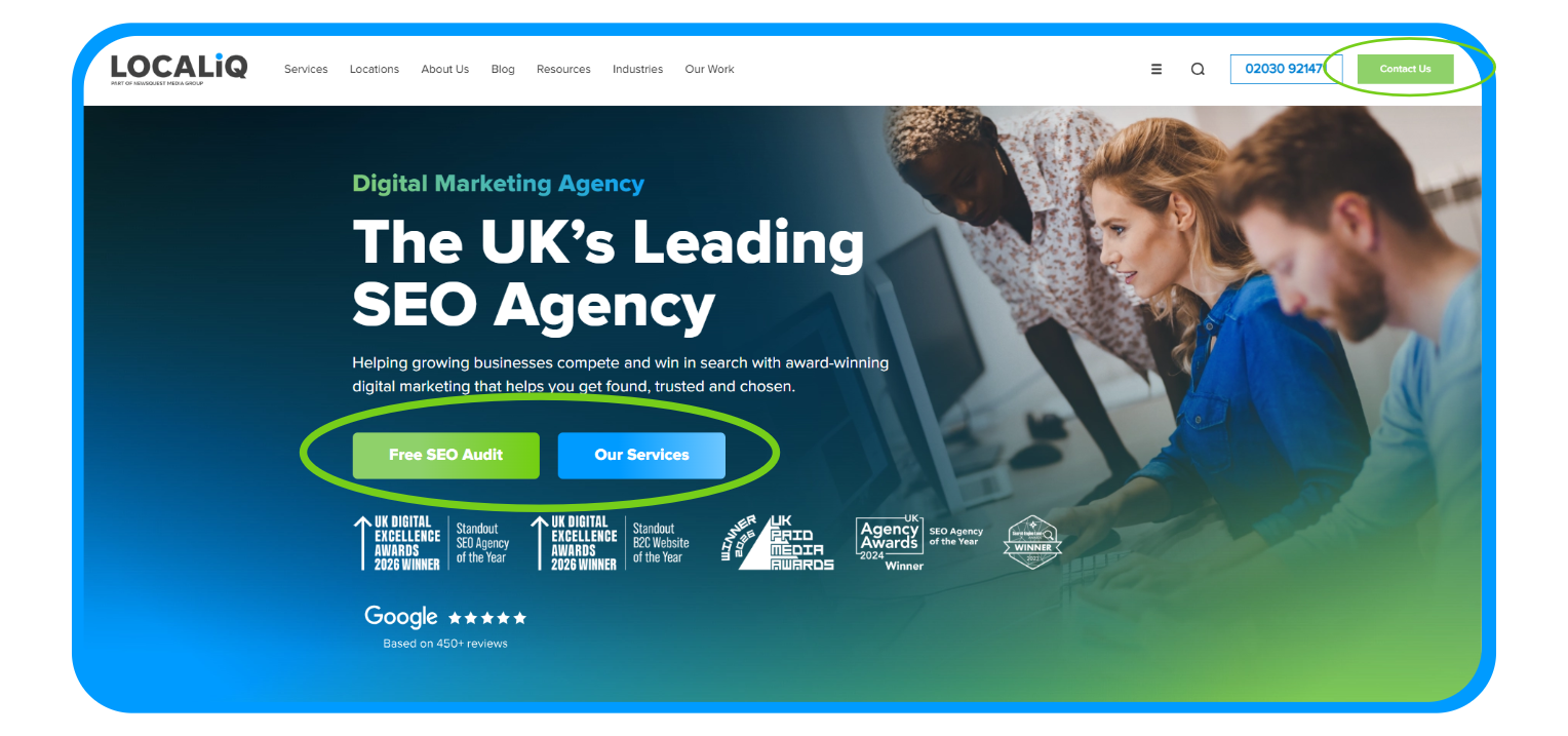
For our website, we made sure the ‘our services’ CTA was clear and accessible to help website users get to the page they want more efficiently, and our ‘free SEO audit’ also has a prominent CTA as this is one of the most frequent actions our site visitors take. We also made sure our contact us CTA was visible and easy to locate.
Check your own site: Open any three pages at random. Does each one make the next step obvious? If a page just ends, it’s leaking enquiries.
9. SEO foundations built in
A good website is discoverable, and discoverability is built into the structure rather than bolted on afterwards:
- Clean, readable URLs: yoursite.co.uk/bathroom-fitting-leeds rather than yoursite.co.uk/page?id=4823
- Unique meta titles and descriptions for every page, written for the searches customers make
- Alt text on images, which helps both search engines and screen reader users
- Internal links connecting related pages, so visitors and search engines can find your most important content
- Schema markup where relevant, helping search engines understand your business type, reviews and services
If you’d like to learn more, our guide to the basics of SEO explains the different types of SEO. Alternatively, view our SEO services here.
10. Accessibility
An accessible website works for everyone, including visitors with visual impairments, motor difficulties or those navigating by keyboard or screen reader. Beyond being the right thing to do, it’s commercially sensible: accessibility overlaps heavily with general usability, and a site that’s easier for everyone converts better for everyone.
The foundations:
- Colour contrast strong enough that text is readable for visually impaired users
- Alt text on every meaningful image
- Keyboard navigation so the site can be used without a mouse
- Descriptive link text: “View our pricing” rather than “click here”
- ARIA labels on interactive elements like menus and forms
Check your own site: Try navigating your homepage using only the Tab key. If you can’t reach your menu, forms and buttons, neither can a significant group of your potential customers.
11. Security
A padlock in the browser bar is the minimum, and its absence is disqualifying: browsers actively warn visitors away from sites without SSL/HTTPS, and Google treats it as a ranking factor.
Beyond SSL, a trustworthy small business website needs secure forms for any customer data, a clear privacy policy, a compliant cookie notice, and software kept up to date. None of this is glamorous, and all of it matters, because a single security warning in a browser undoes every other trust signal on the page.
Check your own site: Look at your browser bar. If your site shows “Not secure” instead of a padlock, fix that before anything else in this guide.
12. Local SEO elements
For UK businesses serving specific areas, the website and the wider local search presence work together. That means:
- Location-specific pages for each area you serve, with genuinely useful content rather than the same page with the town name swapped out
- Your name, address and phone number consistent between your website and every listing
- A well-maintained Google Business Profile connected to your site
Local search is changing quickly, with AI-generated results reshaping how customers find local businesses, and the websites holding their visibility are those with strong local signals built in. Our local SEO services cover this side of the equation in full.
The quick website checklist
Use this small business website checklist to benchmark your site:
- Visitor knows what you do, where, and how to contact you within seconds
- Works flawlessly on mobile, including forms and tappable phone numbers
- Loads in under three seconds
- Less than ten top-level menu items
- Real photography, consistent branding
- Copy structured with proper headings, answering real customer questions
- Reviews, testimonials and full contact details visible
- Clear call to action on every page
- Clean URLs, meta titles, alt text and internal links
- Accessibility: contrast, keyboard navigation, descriptive links
- SSL certificate, secure forms, privacy and cookie policies
- Location pages and consistent business information for local search
If your site ticks all twelve, it’s in better shape than most. If it doesn’t, you now know exactly where to start.
Want to know how your website measures up?
Run your site through our free Website Grader and get an instant benchmark against the standards in this guide. And if the results suggest it’s time for something better, our web design team builds websites for UK businesses with SEO, speed and conversion designed in from the start. Contact us today and we’ll talk through exactly what your business needs.
What makes a good website: FAQs
How much does a good website cost in the UK?
It varies enormously depending on what the site needs to do. A simple brochure site built on a template costs far less than a bespoke site with booking systems or e-commerce. The more useful question is what a poor website costs: slow, confusing sites lose enquiries every day, and that cost usually exceeds the price of fixing them within months.
How many pages should a small business website have?
Enough to answer your customers’ questions properly and no more. For most small businesses that means a homepage, a page per core service, an About page, a contact page, and location pages if you serve multiple areas. Quality and clarity beat page count.
How do I check if my website is any good?
Start with the free tools. Google’s PageSpeed Insights checks speed and mobile usability, and our Website Grader benchmarks your site against the standards in this guide in a few minutes. Then do the human test: ask someone unfamiliar with your business to find a service and your contact details while you watch.
Should I build my own website or use an agency?
If you build it yourself, modern website builders can produce something respectable for a simple brochure site, provided you follow the principles in this guide.
An agency earns its fee when the site needs to actively generate business: proper SEO foundations, conversion-focused design, speed optimisation and content strategy are hard to get right without experience, and mistakes are expensive to discover later.
How often should a website be updated?
Content should be reviewed at least quarterly for accuracy, and software updated as soon as updates are available for security reasons. A full review of the design is typically worth considering every three to five years, or sooner if the site no longer reflects the business or performs poorly on mobile.

Related Articles

Proof That Digital PR Works: 3 Standout Results Delivered by LOCALiQ UK
The Truth About Rising CPCs: Insights from Hundreds of UK Campaigns

LOCALiQ Shortlisted in 4 Categories at the 2026 UK Agency Awards

How to Identify Your Target Audience: A Complete Guide for UK Businesses
7 Ways Customers Are Finding Businesses Online in 2026 (And What's Changed)