A campaign landing page is the first thing visitors land on after clicking a link from your online marketing activity and often the first interaction a user has with your business, so it’s crucial you make a good impression!
In the following post, we’ll discuss what a campaign landing page is, why you need one, and provide examples and tips to help you get started.
- What is a campaign landing page?
- Why do you need a landing page?
- Examples of campaign landing pages.
- Landing pages: when to use them
- Tips to optimise a landing page
- How to improve the relevance and usability of a landing page
What is a campaign landing page?
A landing page is a standalone page on your website that users ‘land’ on after they click on a search result or a CTA used in other marketing materials, whether that be a social ad, search engine listing, link in an email etc.
A campaign landing page should discuss a particular topic. For instance, if your business has launched a new product line, a new resource or has an upcoming event, then you should create a landing page to promote that particular campaign.
The landing pages should be designed to convince users to take one specific action – therefore it needs a direct call-to-action (CTA). Common CTAs are sign-up forms, download now, or special offers which encourage users to purchase a specific product or service.
Why do you need a landing page?
Landing pages are an integral part of all marketing campaigns – they are the destination for traffic after clicking on an ad. A marketing campaign without a destination can be a waste of time and resources.
The aim of a landing page is to convert customers and accumulate leads. Since they provide information about a specific offer or item, and focus on one objective or call to action, landing pages typically convert more traffic than other types of web pages.
Often campaign landing pages are used to gather information about its visitors, in exchange for access to a resource e.g., a report, or monthly newsletter. The data collected can then be used in future marketing campaigns, enabling your business to retarget and remarket to interested leads and prospective customers.
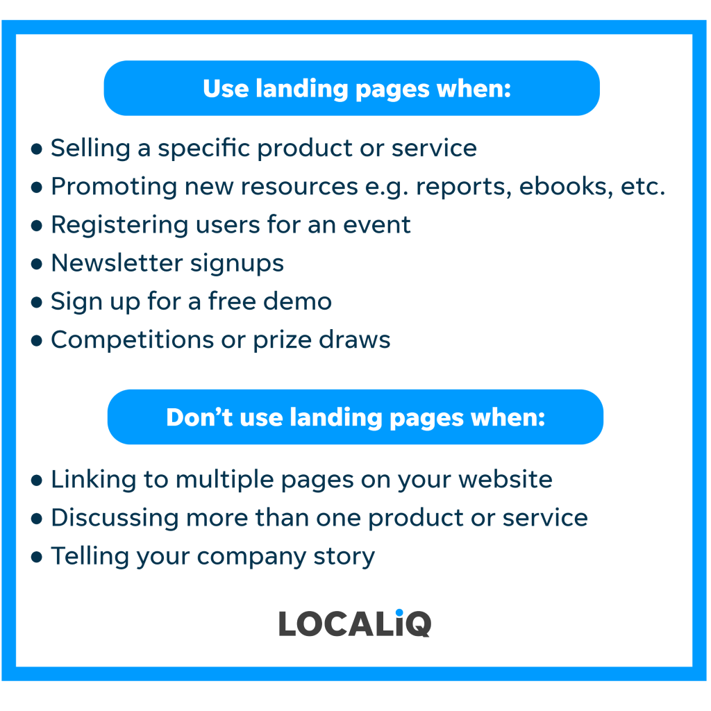
Landing pages: when to use them
You might be wondering why you need to bother with campaign landing pages when you could just direct users to different existing parts of your website. Well, the reason is your existing web pages, such as your homepage, are focal points of your website which host a lot of information and encourage visitors to discover a variety of sections by serving numerous CTA’s. Whilst these are great for users to navigate your website and understand what your business is about, these pages are more informative and unlikely to result in conversions. On the other hand, a campaign landing page is a focused standalone page, with the sole intent to direct users towards one simple CTA.
So, when do you need to use a landing page? Here are some examples…
Examples of campaign landing pages
Here are 3 real-life examples of campaign landing pages so you gauge how to design yours and get conversions for your business.
- LOCALiQ
As a digital marketing agency, we run many campaigns and therefore have a lot of experience building campaign specific landing pages. For instance this is our landing page for our recently published 2023 Search Benchmark Report.
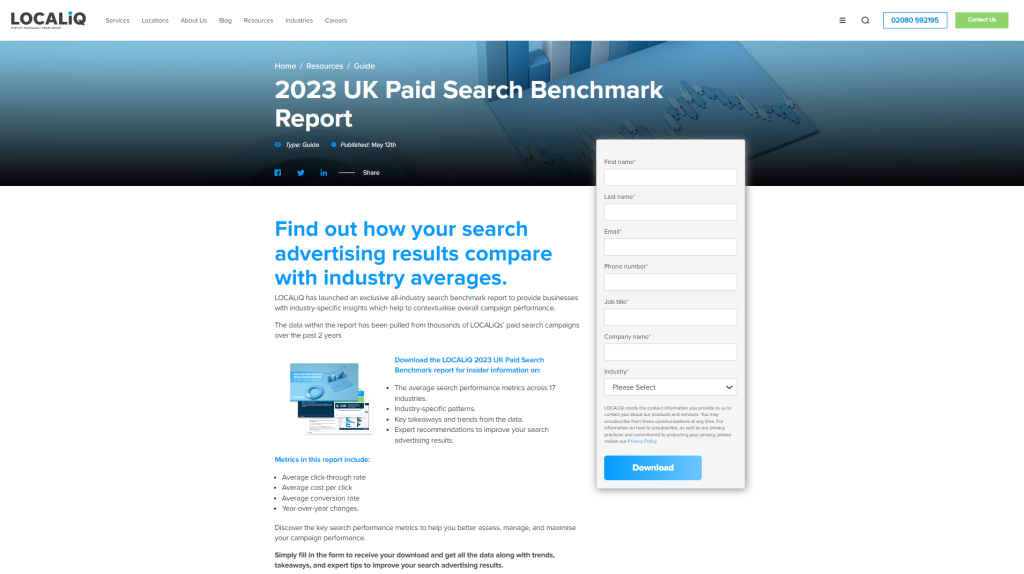
The aim of this page is to collect visitor information in exchange for our access to our exclusive report. As you can see there is only one CTA on the page ‘Download’, and all the copy is centred around the report and why visitors should download it.
2. Airbnb
This next example is from Airbnb. For those who are not familiar with Airbnb, it is basically an online marketplace for short and long-term homestays, where individuals can temporarily rent out their home to others who pay on a daily rate.
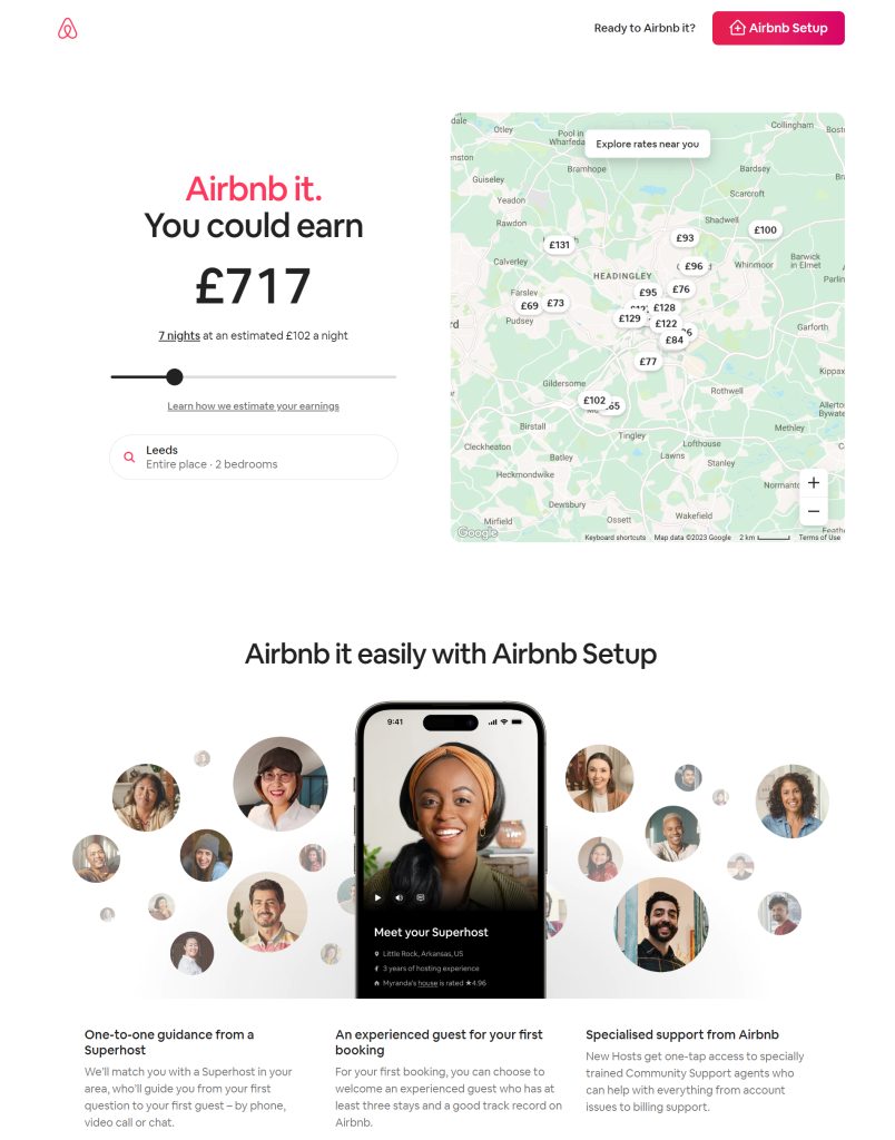
The purpose of this landing page is to encourage users to host through their platform. The page contains key information about the service and a direct CTA to get set up, but my favourite part is the map with the estimated cost per night. It’s the first thing the visitor will see, and a great way to capture their attention and persuade them to take action.
The language used on the landing page is also very convincing, the subheading ‘Airbnb it easily with Airbnb set up’ and the 3 mini paragraphs at the bottom give the user the reassurance they might need to commit and convert.
3. Canva
Canva is a graphic design platform, so it is no surprise that they host workshop events. This landing page is centred around their graphic design workshop with the goal of getting people to register.
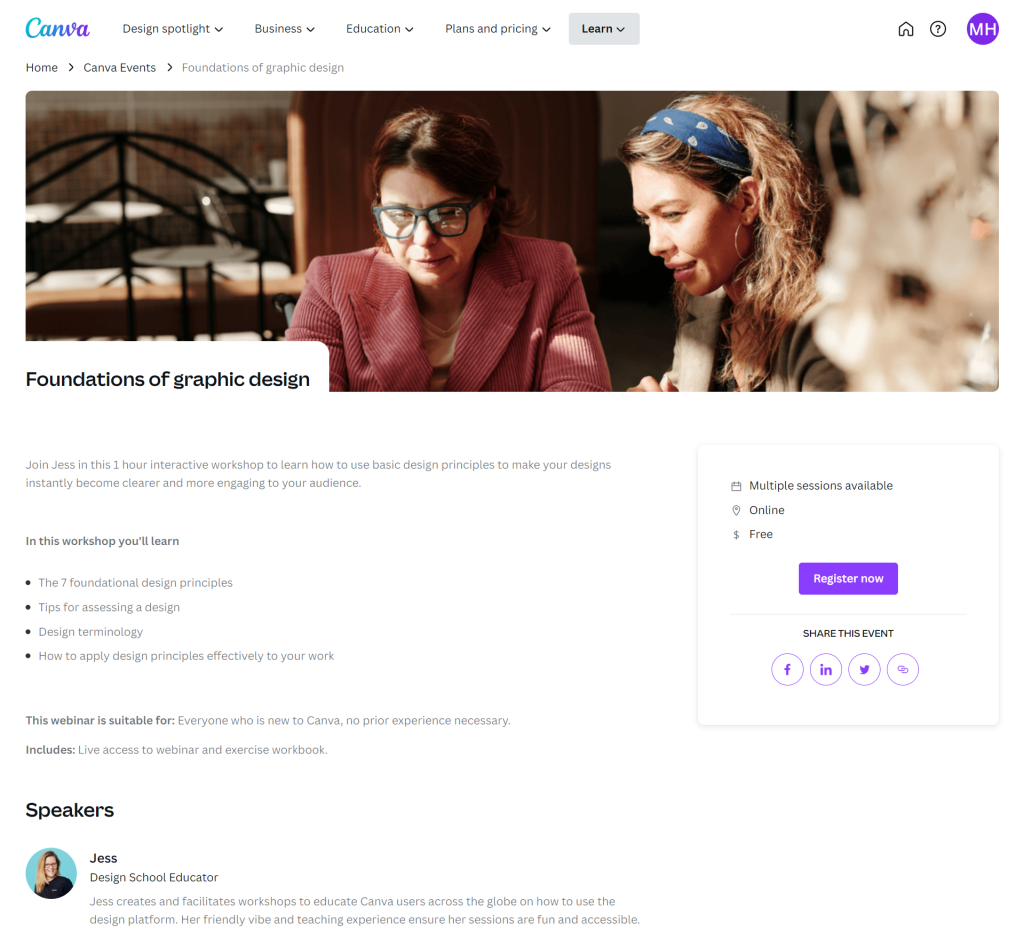
This landing page only includes the most relevant content, information about the workshop itself.
As you can see, there is only one CTA on this page, ‘Register now’, keeping it simple helps to keep the visitor focused on the goal. Once the user clicks the CTA, they are presented with the following pop-up form.
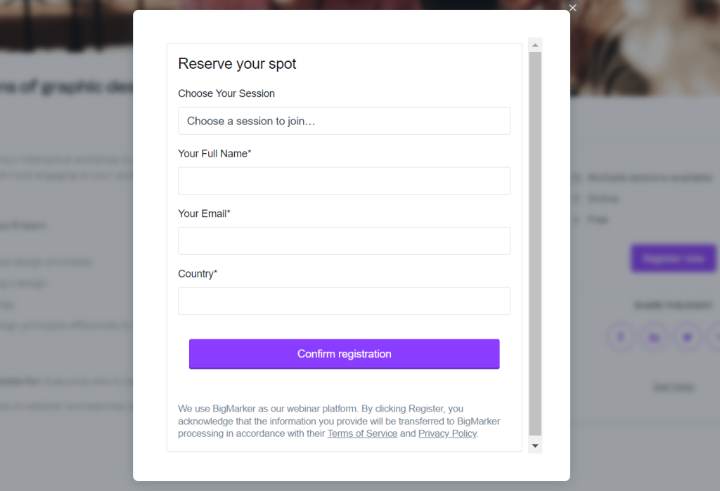
In order to register for the workshop, users first have to fill in the short form. Canva can then use this data to send them information about the workshop, and relevant remarketing emails in future campaigns.
Still stuck on your landing page design? Here are 15 ideas you can use to inspire your own landing pages.
Tips to optimise a landing page
When running campaigns, the landing page is the first place a user lands, and potentially their first interaction with your business meaning it is important to make a good impression.
Here are 5 things you can do to optimise your landing pages:
1. Keep it simple
Only include the most relevant content and CTAs. By keeping the page simple, visitors are less likely to get distracted by multiple links.
2. Include a compelling and direct Call to Action
You want your landing page to have limited navigation – keep it focused on one specific goal and action to avoid users being distracted or confused. A landing page survey highlighted that landing pages with more than five CTAs resulted in 10.5% conversions, whereas, landing pages with only one call to action resulted in 13.5% conversions. Remember to make sure the CTA button is clear, so the user knows what to expect next.
3. Use an eye-catching but relevant image and a persuasive headline
You want to capture your visitors’ attention as soon as they land on the page. A great way to do this is to place a bold and relevant graphic at the top of the landing page. And a persuasive headline which highlights the value of what you are offering.
4. Keep your copy concise
It is advisable to keep your text brief and include only the information that is absolutely necessary. Landing pages with higher word counts often receive fewer conversions. Unbounce’s Conversion Benchmark Report found that landing pages with fewer than 100 words are 50% more effective than those with over 500 words, so concise and brief landing pages are undoubtedly more successful. If you have a large bulk of text, use bullets, headings, and spacing to break it up.
5. Embed a lead capture form
The aim of a landing page is not only to provide value to your users, but also to gather their information. To do this, you should have some sort of lead capture form on your landing page, which users have to fill out. Again, you don’t want to overcomplicate it – only ask for the information that you need and that benefits your business. For instance, if email marketing is your main strategy or you’re hosting an event, you’ll want to know the user’s name and email address so you can send them personalised emails. On the other hand, if your company is centred around sales, you are more likely to collect visitors’ phone numbers so your sales team can call them directly.
How to improve the relevance and usability of a landing page
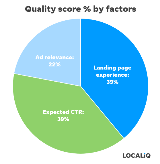
When creating your landing page you need to focus on the relevance and usability of the page itself, as Google considers this as a factor when determining your quality score (which directly affects your ad rank).
Here are three things you can do to ensure you achieve a good landing page experience:
1. Use LOCALiQ website grader
Give your website a free health check with the LOCALiQ website grader. Simply fill in the form to receive a free report which shows how your online presence compares to your competitors, where your digital advertising falls short, and where you can make changes to ensure great results.
Your report includes:
- Your online presence score
- Recommended solutions to build awareness and drive leads
- Actionable areas for improvement
2. Optimise for mobile
According to Statista, mobile web traffic has consistently accounted for about half of all global web traffic since the beginning of 2017. This means you must consider optimising your website for mobile use. Moreover, not doing so will actually be detrimental to your marketing efforts.
To ensure your landing page is optimised for mobile:
- Use simple forms which are easy to fill in
- Have clear and concise copy (avoid any jargon)
- Design a clean web page layout (don’t overcomplicate it)
Top Tip: Keep an eye on how your site is performing on mobile by regularly reviewing your Google Analytics dashboard and frequently running a mobile site speed test.
3. Improve site speed
The longer the loading time, the more likely a user is to abandon the page. Research found that a 2-second delay in load time resulted in abandonment rates of up to 87%.
The ideal website load time is anywhere between 1-2 seconds although Google aims for under half a second.You can use Google’s free page speed tool to analyse your site speed and gain valuable insights. The tool will give you a score out of 100, along with suggestions for improving your page’s load speed and performance.
Summary:
To summarise, a campaign landing page is a standalone page which communicates a focused message about a specific topic. Whilst the page itself should provide value to the visitor, it is a lead generation tool and should be used to collect users personal information.
When creating a landing page remember to follow these 5 tips:
- Keep it simple
- Include a compelling and direct Call to Action
- Use an eye-catching but relevant image and a persuasive headline
- Keep your copy concise
- Embed a lead capture form
I hope you have found this blog insightful and have gained a better understand of what a campaign landing page is, why you need them, and how to optimise it for more conversions.
At LOCALiQ we help a variety of clients across a wide range of industries with their online marketing. If you would like support or guidance with your digital marketing, contact us today for a free consultation where our friendly team will find cost-effective ways to help grow your business online.

Related Articles

How to Optimise for AI-Powered Search: A 2026 Guide for UK Businesses
Prompt Research: The Next Step for AI Search and What UK Businesses Need to Do Now
Non-Commodity Content: What It Is and Why Your Business Needs It
How much does SEO cost in the UK? A 2026 pricing guide
Is Your Business Visible in ChatGPT, Gemini and Perplexity? Here's How to Check