Conversation rates. The haunting KPI of your e-commerce venture, newsletter signup efforts, and basically any form of generating income or customers from your website. Of course, the work you need to do sounds simple. Increase the conversion rate and make more money. Simple, right? Well, not exactly. There are a ton of moving parts when it comes to increasing a conversion rate, including following the trends, outperforming the competition, and making sure you’re actually set up to give your customers what they both want and resonate with. And how you do this successfully comes down to Conversion Rate Optimisation, or CRO for short.
Now, I know what you’re thinking. “Another marketing buzzword? Spare me the jargon!” But trust me, this isn’t just another fleeting trend. CRO is about squeezing every last drop of potential out of your existing website traffic, turning those casual browsers into loyal customers. All through the tweaking of CTAs, A/B testing, and tweaking different aspects of your site and landing pages.
And how you do CRO is what we’re talking about today as we dive into what CRO is, why it matters more than ever in 2024, and how you can leverage it to boost your bottom line.
Expect actionable tips, real-world examples, and even a few cheeky anecdotes along the way.
Let’s get into it.
What is Conversion rate optimisation?
Conversion Rate Optimisation (CRO for short) is the art and science of persuading more website visitors to take a desired action.
This specific action, or conversion, could be anything from filling out a contact form to making a purchase, downloading an ebook, or even just spending more time on your site.
Take a moment to imagine your website as a bustling marketplace.
CRO is like having a skilled salesperson on hand, guiding visitors to the products they’re most interested in, answering their questions, and ultimately convincing them to purchase.
It’s about removing any obstacles or friction that might prevent them from taking that final step.
Why is conversion rate optimisation important?
Now, you might wonder, “Why should I invest time and effort into CRO? I’m already getting decent traffic to my website.” Well, that’s great. What CRO is all about is maximising the return you’re getting on your website already. If 100 people come to your eCommerce website, statistics show that only 2-3 people will convert. That’s an average conversion rate of 2-3%, according to Shopify statistics.
Now, take a moment to think about how much time, effort, and resources it took to get that many people. Instead of continuing down that path and spending more than ever, what if you could optimise what you already had and perhaps make 7-8 of those 100 people convert? Half the effort for double the return.
Other benefits include:
- Maximising your ROI: CRO helps you get more bang for your marketing buck. Instead of spending more money to attract new visitors, you’re focusing on converting the ones you already have. It’s like squeezing more juice out of the same lemon!
- Gain a competitive edge: In today’s cutthroat digital landscape, every little advantage counts. CRO can help you outperform competitors by making your website more user-friendly and persuasive.
- Build long-term success: CRO isn’t just a quick fix; it’s a continuous process of improvement. By constantly analysing and optimising your website, you’ll create a sustainable growth engine for your business.
CRO vs. SEO
CRO and SEO are not rivals; they’re teammates working towards the same goal: more customers and revenue.
- SEO is all about attracting visitors to your website through search engines. It’s like getting your shop noticed on the busiest high street.
- CRO, on the other hand, is about making sure those visitors have a fantastic experience once they arrive, leading them to take action. It’s like having a well-designed shop with helpful staff and irresistible offers. To improve your conversion rate is to improve your visitor experience, and thus your SEO.
By combining SEO and CRO, you create a powerful one-two punch that drives more qualified traffic and converts them into paying customers.
Key CRO and analytics metrics to track
While your conversion rate is the ultimate indicator of success, it’s important to keep an eye on other digital marketing metrics that can reveal valuable insights:
- Bounce rate: The percentage of visitors who leave your site after viewing only one page.
- Time on page: How long visitors stay on each page.
- Click-through rate (CTR): The percentage of people who click on a specific link or CTA.
- Exit rate: The percentage of visitors who leave your site from a particular page.
By monitoring these metrics through your optimisation efforts, you can identify areas for improvement and track the impact of your CRO efforts. The best way to do it is use a professional marketing service, like LocalIQ, who can provide you with a nice-looking report with all these metrics and more laid out, or by signing up to platforms like Google Analytics and seeing for yourself.
Setting Realistic Goals
Before we jump into the CRO strategies, remember that Rome wasn’t built in a day, and neither is a high-converting website.
Start by setting realistic goals and celebrate small wins along the way. Even a slight improvement in your conversion rate can have a significant impact on your bottom line.
15 Actionable tips to boost your landing page for conversion rate optimisation
#1 – Keep It simple
Ever heard the saying, “Less is more”? Well, when it comes to how you can improve conversion rates, it’s the golden rule. A cluttered page is a confused visitor. They land on your page, bombarded with flashy graphics, multiple calls-to-action, and walls of text. Their brain goes into overdrive, and before you know it, they’re clicking away.
Example: If you’ve ever been into a TKMaxx on a Saturday afternoon, you’ll be familiar with the sight of clothes everywhere, unclear product sections, baskets abandoned all over the place, and a ton of empathy for the staff who are responsible for sorting it all.
For you, however, the chances are you won’t be buying anything or finding your way through in a hurry. You’d probably struggle to find what you’re looking for and possibly leave feeling frustrated.
Now picture a sleek, minimalist store with carefully curated displays and clear signage. You can find what you’re looking for with ease, and it looks and feels great to be in this space.
Much more inviting, isn’t it?
Actionable Step: Take a critical look at your landing pages. What can you remove? Can you simplify the design? Does every element have a clear purpose? If it doesn’t, take it out. Aim for a clean, uncluttered layout that guides visitors towards your main goal and only this goal.
To increase conversions even more successfully in this way, take time to understand what your customer pain points are, and then address them through your landing page content.
#2 – Optimise everything above the fold
The “above the fold” is that prime real estate visitors see first when they land on your page. Load up a website of your choice. Everything above the bottom of the screen in that first load without scrolling is “above-the-fold” content. Like when you load up the Shopify homepage, everything you see here is “above the fold”. It’s the first impression and your best opportunity to take your customer’s breath away, so make it count.
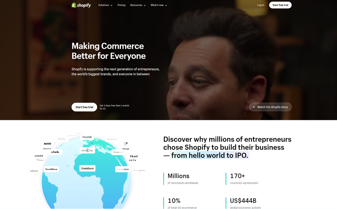
Example: Think of it like the opening scene of a blockbuster movie. It needs to be exciting, engaging, and leave the audience wanting more. A strong headline, a captivating image, and a clear value proposition are your key ingredients here.
A great example is the opening scene of Christopher Nolan’s The Dark Knight. Watch it back. See how they build tension, and you can’t really look away out of interest and curiosity as to what’s going on.
I’m not saying you need the Joker robbing a bank on your website, but you want to pique this level of interest.
Actionable step: Craft a powerful headline that grabs attention and clearly communicates your offer. Choose an image that resonates with your target audience and supports your message. And most importantly, make sure your value proposition is crystal clear. What’s in it for the visitor? Spell it out and make it so simple there’s no room for miscommunication.
#3 – Work on your CTAs
Your call-to-action (CTA) is the gateway to conversion. It’s conversion 101, and any talk on your conversion rate will talk about the importance of CTAs.
It’s that magical button or link that invites visitors to take the next step. Therefore, it should never be a fleeting concern or afterthought.
Example: Imagine you’re at a concert, and the band is rocking the stage. At the end of their set, they simply say, “Thanks for coming.” A bit anticlimactic, right? Now, picture them shouting, “We’re not done yet! Get ready for an encore!” That’s the kind of energy and enthusiasm you want in your CTAs.
Actionable step: Ditch generic “Submit” or “Sign Up” buttons. Craft CTAs that are clear, specific, and action-oriented. Tell visitors exactly what they’ll get by clicking. Instead of “Learn More,” try “Download Your Free Guide Now.” And don’t be afraid to experiment with different colours, sizes, and placement to see what works best. Check your site’s conversion rate now, change the CTAs, let your pages run for a week, and see if there’s any improvement.
#4 – Everything must be mobile-first
Everyone is on their mobiles and tablets these days. It makes up over 55% of all internet traffic, after all. Therefore, there’s a 50% chance your visitors are coming to your website via mobile devices.
If your landing pages aren’t optimised for a good experience, they simply won’t be converting.
So, is your website optimised for tiny screens, or do people have to try and accurately tap the button they want to click or have to zoom right in to read the text on the screen?
Example: Imagine trying to read a traditional newspaper on your phone without zooming in. Frustrating, right? The same goes for landing pages. If they’re not designed with mobile in mind, visitors will struggle to read the content and navigate the page, leading to a quick exit.
Actionable step: Make sure your landing pages are responsive and adapt seamlessly to different screen sizes. Keep the design simple, the text concise, and the CTAs easy to tap with a thumb. CRO test your pages on various devices to ensure a smooth user experience across the board.
#5 – Use visual storytelling
A picture paints a thousand words, they say (maybe?), and on landing pages, it can also lead to a thousand conversions. Or at least an increased number of conversions. Humans are visual creatures drawn to images that spark emotions and tell a story. Therefore, the visuals you use are a core part of your conversion funnel.
If you can use video, then that’s even better.
Example: Think of a charity advert showing a child in need. The image instantly tugs at your heartstrings and compels you to take action. On your landing page, you might showcase a customer beaming with delight while using your product or a captivating scene that embodies the lifestyle your brand represents.
Actionable step: Ditch the generic stock photos. Invest in high-quality images that capture the essence of your brand and resonate with your target audience. Use them strategically to support your message and
guide visitors’ attention to your CTA. Use a professional photographer if you can for even better results.
#6 – Make everything as fast as possible
We live in a world of instant gratification. It’s a sad truth. Most people have the literal attention span of a goldfish. If your landing page takes ages to load (and I’m literally talking about more than two seconds), visitors will be gone faster than you can say, “conversion rate optimisation.”
Example: Imagine you’re waiting in a long queue at the supermarket. You glance at your watch, sigh impatiently, and eventually abandon your trolley and leave. Slow-loading landing pages have the same effect.
Actionable step: Optimise your page load speed by compressing images, minimising code, and leveraging browser caching. Test your page speed using tools like Google PageSpeed Insights, and make the necessary tweaks to ensure lightning-fast performance.
#7 – Make the most of social proof
Remember that time you were on the fence about trying a new restaurant, but then you saw a queue of people eagerly waiting outside? Or when someone gives you a recommendation for a store or movie in the cinema, and you feel absolutely compelled to check it out? That’s social proof in action.
People trust other people, and showcasing the positive experiences of your customers can be a powerful conversion booster.
Example: Think of testimonials as little love letters from your happy customers. They vouch for your product or service, giving potential buyers the confidence to take the leap. You can also showcase case studies, social media mentions, or even just the number of people who have already signed up or purchased.
Actionable step: Gather testimonials from satisfied customers and sprinkle them throughout your landing page. Highlight specific results or benefits they experienced. If you have impressive stats or case studies, don’t be shy about sharing them! If you can get your customers to give you video testimonials that you can share as well, then absolutely do that.
#8 – Make sure your messaging Is correct
Imagine clicking on an ad that promises a “Free 30-Day Trial,” only to land on a page that asks for your credit card details. Frustrating, right? That’s a classic example of message mismatch, and people in today’s world absolutely hate it. It’s a sure-fire way to get people to never come back to your website.
Treat your customers right from the beginning, and they’ll treat you right for life.
Example: Think of it like a first date. If your online profile promises a charming, witty conversationalist, but you show up grumpy and monosyllabic, your date’s not going to be impressed. The same goes for your landing pages.
Actionable step: Make sure your ad copy and landing page messaging are aligned. The headline, offer, and call-to-action should all be consistent, creating a seamless transition from the ad to the landing page.
This builds trust and increases the likelihood of conversion.
#9 – Optimise landing page navigation (visual hierarchy)
Imagine you’re exploring a new city like Tokyo or New York, where the streets are a full of signs and bright billboards all competing for your attention. It’s overwhelming, isn’t it? Now, imagine a quiet street, with minimal street signs, well-signed landmarks, and a logical flow that guides you effortlessly.
This is the kind of supportive visual hierarchy you want on your website.
You might set everything up and know where everything is and where to go, but is it easy for customers visiting your website for the first time to figure it out?
Example: Think of your landing page as a guided tour. Use design elements like headlines, font sizes, colours, and spacing to lead visitors’ eyes to the most important information first, then the next, and so on. It’s like laying out a trail of breadcrumbs that leads them straight to your conversion goal.
Actionable step: Review your landing page with a critical eye. Is it clear what the main message is? Are the CTAs prominent and easily noticeable? Are the key benefits highlighted effectively? Use size, colour, and placement to create a clear visual hierarchy that guides visitors on their journey.
#10 – Use colour like a pro
Colours aren’t just a matter of aesthetics. They have a profound impact on our emotions and can influence our decisions. We actually have a blog on website colour schemes, which explains the psychology of colour, as well as providing real life examples.
Example: Ever notice how eco-focused companies often use the colour green? This is because when people see this colour they automatically associate it with nature. On the other hand, blue is often associated with trust and security, which is why many banks, corporations, and financial institutions use it.
Actionable step: Research colour psychology and choose a palette that aligns with your brand and the emotions you want to evoke on your landing page. Use contrasting colours for your CTAs to make them stand out, and don’t be afraid to experiment to see what works best for your audience.
#11 – Start to implement AI chatbots
These days, AI chatbots are seemingly everywhere, especially on larger websites. They pop up in the corner asking if they can help us, and truth be told, you’ve probably used them more than once to figure something out. Why not offer this convenience to your customers? Think of it as having a friendly and knowledgeable assistant available 24/7 to engage your visitors, answer their questions, and guide them towards conversion.
Example: Imagine you’re browsing an online shop late at night, and you have a question about a product. Instead of waiting for an email reply the next day, an AI chatbot pops up and provides instant answers, helping you make a purchase decision right then and there. Boom! Conversion achieved.
Actionable step: Explore the world of AI chatbots and see how they can enhance your landing page experience. Consider using them to provide product recommendations, answer FAQs, or even offer personalised discounts. The key is to make them helpful, engaging, and seamlessly integrated into your page design. Always make sure you provide a way for the user to contact a real person too, this will eliminate any frustrations if their question isn’t answered via the chat bot.
#12 – Personalise the journey
We all love feeling special, right? The same goes for your website visitors. Generic, one-size-fits-all landing pages are so last year. In 2024, it’s all about personalisation.
Example: Imagine walking into a tailor shop and being presented with a suit that fits you perfectly without even taking any measurements. That’s the power of personalisation. On your landing pages, you can tailor the content, imagery, and offers based on the visitor’s location, interests, or browsing behaviour.
Actionable step: Start by segmenting your audience based on demographics, interests, or past behaviour. Then, create targeted landing pages or use dynamic content to deliver personalised experiences that resonate with each segment. This will make visitors feel seen and understood, increasing the likelihood of conversion.
#13 – Contrast is king
Picture a vibrant red button screaming “Click here” against a plain, light background. It’s impossible to miss, right?

It stands out and grabs your attention instantly. That’s contrast. It’s an easy method to help elements of your website or landing page stand out and grab your reader’s attention instantly. It tells them what’s important and gets the conversion process started right away.
When it comes to your CTAs, you want them to stand out like a beacon in the night, guiding visitors towards that all-important click.
Example: Imagine a football pitch. The players wear bright jerseys that contrast sharply with the pitch they play on, making them easy to spot and follow. Your CTA should be the star player on your landing page, grabbing attention and leading the action.
Actionable step: Experiment with contrasting colours for your CTAs. Use a colour wheel to find complementary colours that pop against your background. Also, consider using a larger font size and adding a subtle shadow or hover effect to make your CTA even more prominent. Remember, a well-designed CTA can make all the difference between a bounce and a conversion.
#14 – Optimise form fields everywhere
We all love collecting data about our visitors, but bombarding them with a lengthy form is a sure-fire way to send them running for the hills. Remember, the goal is to make the conversion process as smooth and frictionless as possible.
Example: Imagine going to a restaurant and being handed a 10-page menu with hundreds of options. Overwhelming, right? You’d probably struggle to decide and might even leave without ordering. Keep your forms short and sweet, just like a curated menu with only the most delicious options.
Actionable Step: Take a critical look at your forms and ask yourself, “Do I really need to know their mother’s maiden name?” (Hint: probably not). Remove any unnecessary fields, and only ask for essential information. If you need more details, consider using progressive profiling or multi-step forms to gather them gradually.
#15 – Get involved in A/B testing
Ever played “Would you rather?”? A/B testing is like the grown-up, data-driven version of that game, but with your landing pages. It’s all about experimenting with different variations to see what resonates best with your audience.
Example: Imagine you’re trialling a recipe for a new cake to sell at your coffee shop. You’re unsure whether to use chocolate chips or blueberries, so make two batches and let your friends taste-test. The one they devour the fastest is the winner! A/B testing enables you to do the same thing with your landing pages, trying out different headlines, CTAs, images, and layouts to see which ones convert best.
Actionable step: Don’t just rely on gut instinct. Use A/B testing tools to create different versions of your landing pages and track their performance. Pay attention to metrics like click-through rates, conversion rates, and time on page. Use the data to make informed decisions and continuously improve your pages. Remember, the only way to truly know what works is to test it!
Long-term strategies to go beyond landing pages
Right, we’ve given your landing pages a serious glow-up, but the journey doesn’t end there. This is an ongoing marathon where you’ll keep tweaking and keep making things better until you literally cannot increase that conversion rate by even 1%. What’s more, you don’t want to make these changes, see improvements for a bit, and then it dies down. We’re talking about optimisation for the long haul, and, therefore, you need some long-term strategies in place to keep things clicking over.
Additional steps:
- Optimise thank you pages: Ever thought of those “Thank You” pages as an afterthought? Well, think again! They’re a golden opportunity to continue the conversation, offer additional value, and encourage further engagement. Upsell, cross-sell, prompt social follows, or even just offer a heartfelt thanks – the possibilities are endless.
- Create traffic acquisition pipelines: Building a steady stream of visitors is like having a constant supply of fresh ingredients for your conversion kitchen. Craft organic and paid strategies that work in harmony to attract the right audience to your landing pages. SEO, content marketing, social media, paid ads – the works!
- Nurture leads with email marketing and automation: So, you’ve captured some leads – brilliant! Now, it’s time to woo them with personalised, relevant emails that nurture them through the sales funnel. Think of it like a courtship, building trust and demonstrating value until they’re ready to say “I do” to your product or service.
- Build a community: Remember, happy customers are your biggest cheerleaders. Create a space where they can connect, share their experiences, and feel like they belong. It could be a forum, a Facebook group, or even just regular meetups. This fosters loyalty and encourages word-of-mouth marketing, which is gold dust for any business.
- Explore partnerships and collaborations: Two heads are better than one, right? Partnering with complementary businesses can open up new audiences and create exciting opportunities for cross-promotion. Think guest blogging, co-hosting webinars, or even joint product launches.
- Utilise retargeting ads: Not everyone converts on the first visit. That’s where retargeting comes in. It’s like a gentle reminder to those who showed interest but didn’t entirely take the plunge. Show them relevant ads as they browse the web, and you might just rekindle that spark and win them over.
Over to You
We’ve covered a lot of ground, haven’t we? From understanding the fundamentals of conversion rate optimisation to diving into actionable tips and long-term strategies, we’ve given your conversion rate optimisation toolbox a serious upgrade. Remember, the key takeaways here are:
- Conversion rate optimisation is a continuous process: It’s not a one-and-done deal. Keep testing, experimenting, and learning to stay ahead of the curve.
- Start with the high-impact areas: Focus on your landing pages, checkout process, and key conversion points first.
- Small changes can yield big results: Don’t underestimate the power of tweaking a headline or changing a button colour.
- User experience is king: Put yourself in your visitor’s shoes. Is your website easy to navigate, informative, and enjoyable? If not, it’s time for a revamp.
So, it’s time to roll up your sleeves and put these strategies into action. Don’t be afraid to get creative, try new things, and, most importantly, have fun along the way.
CRO might sound technical, but it’s really about understanding your audience and creating a website that caters to their needs and desires.
And if you need any help along the way, get in contact with our team here at LOCALiQ. Our award-winning team are experienced in boosting conversions for UK businesses.


