Your website navigation is the most important thing to consider when building or improving a website. Navigation will help a user reach their end goal and it is your job to ensure that happens. This blog will look at several types of website navigation and help you decide which one is best for your website.

What is website navigation?
You want to ensure you have plenty of visitors to your website. To do this you market your website on different platforms, but you want people to be able to navigate your website when they land on it. Website navigation is the straightforward process of ensuring a user can navigate around a website. Navigation is an essential element in user experience (UX). Website navigation comes in many different forms and there are no set-in-stone rules for navigation. Navigation helps get the user to their intended page in as few clicks as possible. The unofficial rule is that the user should get to the intended page in a maximum of 3 clicks. However, in recent years, some suggest that usability comes down to 5 components: effectiveness, efficiency, engagement, error tolerance and ease to learn.
- Effective – How a user achieves the goals.
- Efficient – This measures how long it took and how accurately they achieved the outcome.
- Engaging – This assesses how engaging the interface is to use.
- Error tolerant – This program is designed to prevent errors and help the user recover from any errors that may occur.
- Easy to learn – Often the biggest barrier to overcome, how easy is an application to learn. Some users may switch off your website if it is too difficult to navigate.
With all that in place, you should then be able to ensure a customer achieves their end goal in as few clicks as possible.
Why is website navigation important?
Website navigation is important as it helps guide a user to their end goal. A poor navigation system can have an enormous impact on a business. For example, they may not be able to check out or sign up for a newsletter, losing you potentially hundreds of customers. Let’s look at just some of the ways that navigation affects outcomes:
- Navigation impacts traffic – A poor navigation system can reduce your search engine ranking.
- Navigation impacts sales and lead generation – If someone cannot use your website effectively, they will not give you their personal information or purchase from you. Your poor website navigation impacts the trust someone has in your website and brand.
- Navigation impacts brand perception – As above, poorly designed navigation will push users to alternative websites and brands and leave your brand with a weakened reputation.
- Navigation impacts accessibility – Some people may use a mouse to scroll, while others may use the arrow keys. You should always make sure that your website can be navigated by those with disabilities.
Types of website navigation
There is no one way to design website navigation, there are many ways. This section will include several types of website navigation that are most used today across a variety of websites.
Header navigation
The first thing we are going to look at is header navigation. This is used in the majority of websites today. From the image below, you can see that the navigation consists of a bar with the main topic headers on it. Each one of those headers will take you to the section you need to go to.

Image credit – LOCALiQ
This simplistic style is the go-to for many websites and it is easy to understand why. Everyone automatically looks at the top of the website for navigation and it is there plain for all to see, and as you can see from the second image, some of the headers drop-down to reveal more options, in this case, services offered by LOCALiQ. This is a fantastic way to allow users to get even closer to their intended page.
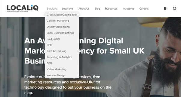
Image credit – LOCALiQ
Footer navigation
A lot of websites now have footer navigation. Again, this can help a user find things they want to access such as contact details or location. Take a look at LOCALiQ’s footer. As you can see, a lot of the information that was in the header navigation is also in the footer navigation, as well as some suggested readers’ favourites. You can also notice that the contact us details as earlier mentioned is also available in the footer menu.
Your footer navigation does not need to be as in-depth as the LOCALiQ example, you can just have basic contact info and links to your social media sites. It is up to you what to put in it.
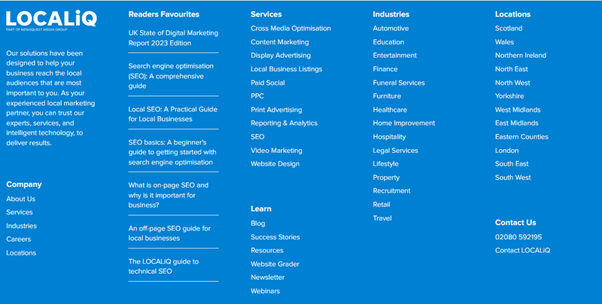
Image credit – LOCALiQ
Vertical/Side menu
One of the most usual places you will see sidebar navigation is on your email browser. With left-side navigation, you can have your menus direct onto the main image, alternatively, you can also have the side navigation as a separate entity. Whatever you choose is fine, just make sure that it is readable. Arbor restaurant (image below) opt to keep their side menu separate from their main image and the contrast really draws your attention in.
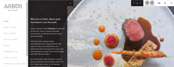
Image Credit – Arbor Restaurant
Hamburger menu
Why is a hamburger menu called a hamburger? Because its icon looks just like a stacked burger! This menu is often used in mobile design as it can help save space and can help a website’s design look clean. Additionally, the hamburger icon is instantly recognisable, and people will know to click on it for more menus.
Take a look at the images below. Both are screen grabs of the exact same page (images 1 and 3), the top one was where the window was compressed on the screen, and the second one was full screen. In the first image, you can see a small icon that has 3 lines on it. Once that was clicked to open, (image 2) you can see the topics (men, women kids etc) are the same as the topics used in image 3 (full-screen image)
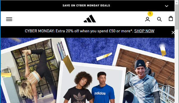
Image Credit: Adidas (compressed screen)
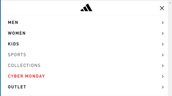
Image Credit – Adidas – The burger menu from a compressed screen
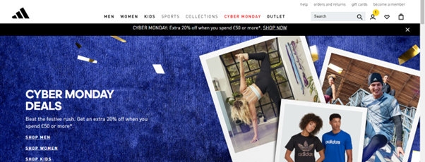
Image Credit – Adidas (full screen)
Navigation menus can also be sticky. This simply means that the menu sticks to the top (or side) of the screen as the user scrolls down the webpage.
Some navigation best practices
These tips can be handy if you are beginning to lay out your website or want to make some tweaks. Remember of course if you are making tweaks to post about the changes on social media and email and encourage people to look at your new and improved site!
- Consider what essential information is needed in your headers and footers – Consider what those people on your site already search for and what pages are viewed the most. These are likely the pages that you should have in your navigation. You do not want your navigation to become over-cluttered and messy or else users will not be able to use your site. Keep it neat, tidy, and streamlined.
- Use drop-down menus – This can help your website look more organised. Start with a good hierarchy. At the top level, you want the broadest subject (for instance about us). At the next level, you can include much more detail (for instance, our history, our initiatives, our awards, our staff, and our contact details)
- Stick to the norm – Yes you could put your navigation anywhere you like, but how will people know where to look? You are best sticking to the traditional placements (top of page, bottom of page and sides of pages). Again, people expect to find what they want quickly and will not spend time looking for things, so your creativity here can ruin your brand.
- Be user-centric – Consider those people that use your site. What do they look for and what do they need? You want to make sure your website navigation (and indeed your whole website) is built with the user in mind.
- Make sure your navigation is mobile responsive – Test, test, and treble test! Make sure your navigation works just as well on mobile as on desktop. Ensure that the menus open correctly and that you can easily click each link. If you have buttons in the menu, make sure that they are not too close together.
- Do your research – Instead of just reading about navigation, why not look at some of your favourite websites and see what they include in their navigation? Another great tip would be to look at your competitor’s websites and see what they do. Assess if there is an industry-standard. If there is an industry-standard, then you may want to follow that one.
- Don’t use icons instead of words – This will be the general rule unless people know what the icons are. What we are getting at here is for you not to use icons you think may work for something. If the icon is recognisable then that is ok (for instance if your website sells used cars, you could use brand logos instead of the car brand names). Images can work, just look at this wonderful menu from Audi using images of each of the cars they sell.
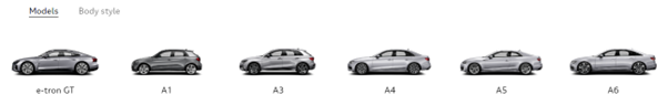
Image credit – Audi
We hope this blog has helped you understand more about website navigation and has given you some inspiration to design your own navigation bars. If you want a bespoke quote on a website design, we have a whole page dedicated to some of the work we have done for our clients. Alternatively, you can contact us today for more information.
Related Articles

How to Optimise for AI-Powered Search: A 2026 Guide for UK Businesses
Prompt Research: The Next Step for AI Search and What UK Businesses Need to Do Now
Non-Commodity Content: What It Is and Why Your Business Needs It
How much does SEO cost in the UK? A 2026 pricing guide
Is Your Business Visible in ChatGPT, Gemini and Perplexity? Here's How to Check