Pop-ups may alienate opinions, but one thing is certain: they work. A person spends 52 seconds on average on a web page and although that isn’t a lot of time, an exit intent pop-up might be able to persuade them to stay. The longer they stay on your site, the more likely they are to convert. An exit pop-up is among the most powerful and well-timed tools in a digital marketer’s world, as it can capture some of your site visitors if they miss the other calls to action on your site.
What is an exit intent pop-up?
When a user looks like they’re about to leave a website, an exit intent notification appears on their screen. An exit pop-up will usually present an offer or a message to entice a visitor to stay on the page and possibly convert. Exit intent pop-ups can be a cost-effective lead-generation tool when used with the correct timing and message. They can also assist you in the following ways:
- Visitors will spend more time on your site if you can keep them there.
- Increase the number of conversions.
- Reduce cart abandonment rates.
- Grow your email subscriber list.
How do exit intent pop-ups work?
Consider a visitor coming to your e-commerce site who is looking through your product line. They then opt to leave the web page they’re on and move their cursor away from your web page. However, they are enticed to stay on the page by a pop-up with an offer such as a coupon code or a free trial. Instead of leaving your site, they click your call to action (CTA) and convert.
Exit intent pop-ups on mobile
Mobile devices account for more than half of all website traffic. On mobile, however, there is no effective mechanism to track leave intent. But how does this method work on mobile devices if exit intent pop-ups work by tracking cursor movement? To determine exit intent on mobile, pop-up tools use a variety of triggers. When a viewer visits your website on a mobile device, a pop-up may appear when they:
- Return to the previous page.
- A percentage of a page is scrolled.
- Scrolling up instead of down.
- Switch between various tabs.
- Remain on the same page for a given amount of time.
- Leave a page unattended.
- A JavaScript element is triggered.
Create different exit intent pop-ups for desktop and mobile devices as best practices. This way, regardless of how your audience browses, you can give them the greatest experience possible.
Best practices for exit intent pop-ups
There is no one-size-fits-all approach to exit intent pop-ups, just as there is no one-size-fits-all approach to anything else in marketing. There are different techniques you may take, and some are more effective than others. Here are six things to think about if you want your pop-ups to convert well:
- Have a clear benefit and a simple message: Keep in mind that this individual is about to leave the site, so you’ll need to attract their attention swiftly and with minimal effort on their part.
- Only inquire about key information: You don’t want to ask for too much, so leave out everything you won’t utilise. However, if the visitor has already provided their name and email address, it’s worth asking for their phone number or their birthday as well – it only takes a few seconds for them to complete and gives you more segmentation options, which can pay off later.
- Target the pop-up: Using the same pop-up on every page is likely to be ineffective compared to customising the message for each page. For example, a discount might be appropriate for the homepage, whereas product pages could highlight some of your store’s features to decrease cart abandonment, such as free delivery, free returns, or the introduction of new products.
- Consider gamification: Pop-ups do not have to be static text and picture blocks. For example, an incentivised wheel of fortune is a fun interactive game and can show up when your website visitors will benefit the most from it.
- Make use of social proof: It might be tough to gain someone’s trust, especially when you get bombarded with advertisements every day. That’s why social proof is effective, it alleviates some of the perceived danger by demonstrating to your visitors that others love what you have to offer.
- Create a sense of urgency: Conversions can be boosted by using urgency and fear of missing out. Instead of simply offering a discount, make it obvious that it is only available for a limited time or has exclusive features.
Why use exit intent pop-ups?
Exit intent pop-ups operate by giving instant and simple value to your website visitors. If and when done correctly, exit intent pop-ups help to retain your users, so they are on your site for longer. Exit intent pop-ups can be an effective method for raising income when they’re shared on the right web pages at the appropriate moment.
Reminder: You should only use exit intent pop-ups when users have not yet taken action. Your audience may feel impersonal and frustrated if your pop-up appears at the wrong time.
Tips on creating a good exit intent pop-up
Pop-ups are not for everyone. However, a fantastic exit intent pop-up, when used properly, can have a significant influence. That unique offer might quickly become irritating if a website has too many pop-ups or is poorly designed. Let’s discuss what makes an exit intent pop-up so effective.
Copy
The message in an exit intent pop-up should be clear and concise. As a result, create a compelling title and keep your explanation brief and easy to read. Consider how your pop-up can help your visitors solve an issue or provide a valuable answer.
Call-to-action (CTA)
Make sure your call to action is clear and easy to comprehend. The use of motivational words and phrases is essential. Your offer should be one-of-a-kind and consistent with your brand.
Suitable images
The appropriate image for exit intent should be related to your offer. It should also appeal to your intended audience. The right photos attract the visitor’s attention but aren’t so noisy that they take away from your offer.
Design
Your pop-up should be easy to read, scan, and display well on mobile devices. It should also complement the look and feel of your website. You should also consider the user experience. Some users don’t mind if a pop-up takes up the entire window whereas others may find it distracting and would prefer a smaller pop-up to the side or at the bottom of the screen.
Testing
To ensure that your pop-us are targeting prospects and customers at the appropriate points in the buyer journey, you may need to run many tests. For example, A/B tests can help you enhance the location and messaging of your pop-ups.
18 exit intent pop-up examples
It’s critical to know the needs of a visitor when choosing exit intent offers. Consider why they’ve arrived at a page, how they got there, and what they’re anticipating. Once you’re in that mentality, you can figure out the greatest offer to make, that will help them convert and avoid leaving your site.
Here are 18 exit intent pop-up examples that you can use as inspiration:
1. HubSpot
HubSpot’s exit intent pop-up is used to acquire email address subscribers for their mailing list. They understand that if they’ve read a certain number of content on their site, then you’ll be interested in receiving their newsletter. They also include social proof by using the title Join 215,00 Fellow Marketers to back up the worth of their content. Shouldn’t you join their email list since 215,000 others have already done so?
2. Zendesk
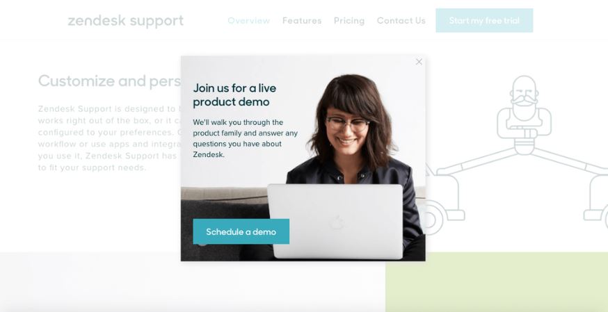
When you try and leave Zendesk’s website, an exit intent pop-up appears, encouraging you to schedule a live product demo of their HR software. They use a friendly image and provide a no-obligation way to learn more about their product. While the majority of visitors will still bounce, it will undoubtedly assist Zendesk in converting more visitors into demo sign-ups.
3. Push Living
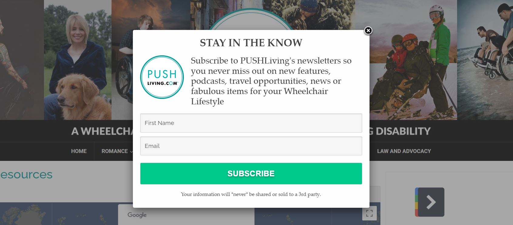
This pop-up is effective because the text explains who this newsletter is for and what you’ll get if you subscribe in an easy-to-understand manner. The subscribe button is large and prominent, making it clear what action they want you to take.
4. ActiveCampaign
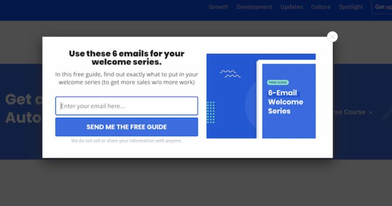
Why do pop-ups like this work so well? Six free email templates are available in this example. ActiveCampaign provides value to its target audience by providing useful information. They are also positioning themselves as an industry thought leader.
5. WordStream
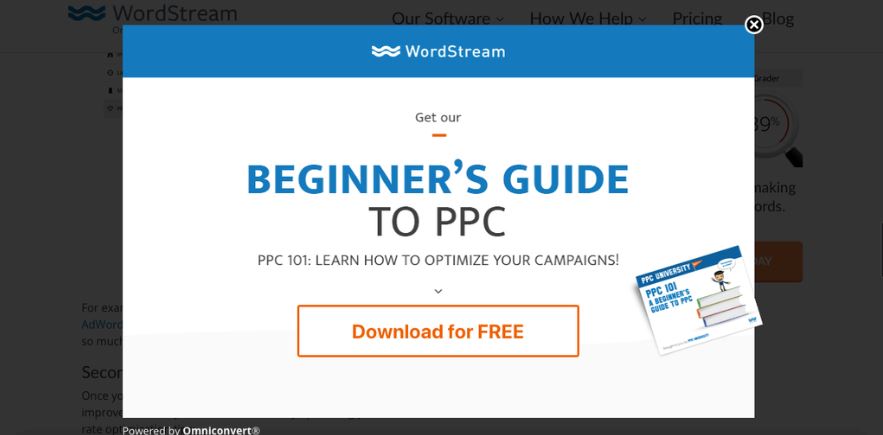
On their exit intent pop-up window, WordStream promotes their e-guide Beginner’s Guide to PPC. They serve a piece of content that they think you’ll enjoy based on the URL you’re reading. This ad’s goal is to keep visitors reading the site and direct them to a higher-converting landing page (an e-guide or an email-gated piece of content). Longer sessions on the site and more page views per session can help with search engine optimisation (SEO) and conversion rate.
6. General Assembly
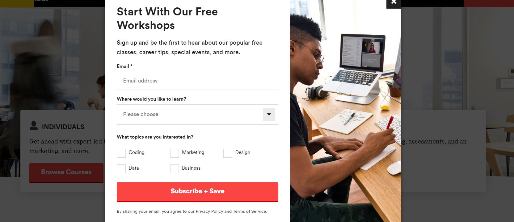
Why is this pop-up effective? General Assembly employs a clever headline to entice you to fill out this pop-up form. There are only three fields to complete, and they’ve limited your options so you can finish the form quickly. The topics are also highlighted in a pop-up at the bottom of the page, in case you missed it from scanning the website.
7. Coursera
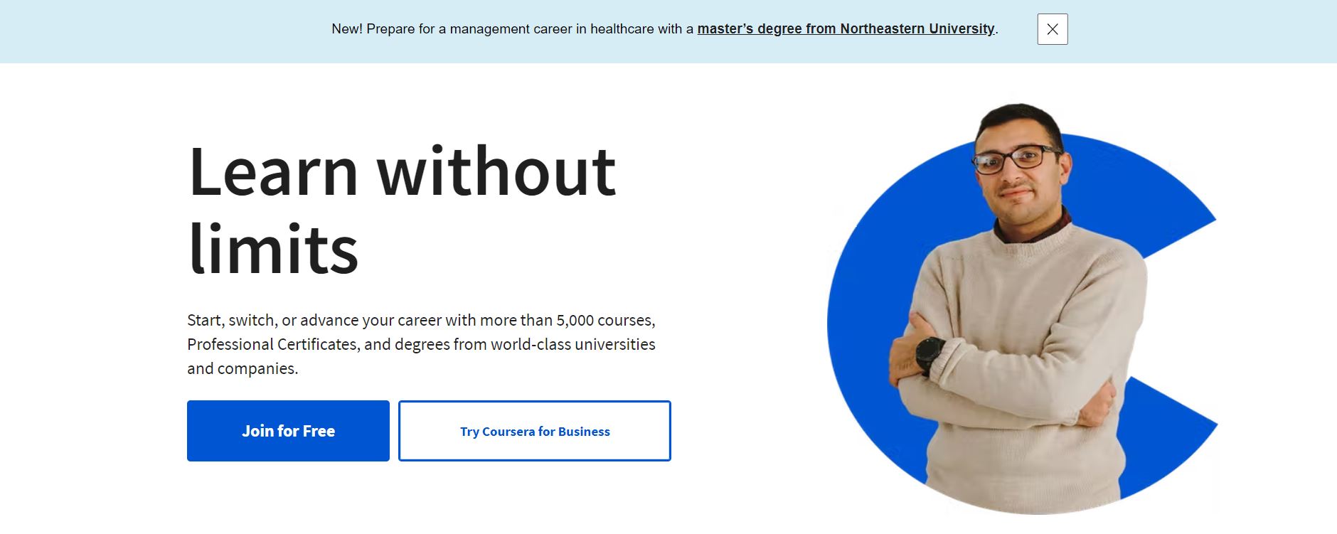
This pop-up works well because a pop-up at the bottom of the screen signals a quick request. Your help is required to determine how you learned about Coursera. As you can see, the writing is concise and straightforward, outlining the length of time the survey will take and the types of questions to be asked.
8. thredUP
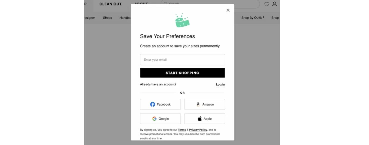
Why do pop-ups like this work? There are a lot of pop-ups on this site that help with the buying process. They personalise the website experience with a sign-up offer before you leave. The form is a quick way to save the data you’ve already shared. This example appears to be a natural part of the shopping experience, rather than being intrusive.
9. Neil Patel
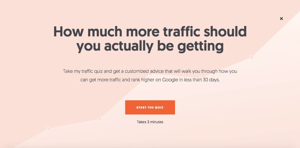
This is a great example of why Neil Patel is a master of SEO and conversion optimisation. He creates a headline that entices his audience (most of who are digital marketers). Following that, he explains why you should take the quiz as well as how long it will take. Neil can identify leads and better convert what would have been abandoned traffic by taking the quiz. To keep visitors on your site for a long time and reduce bounce rates, a quiz is great!
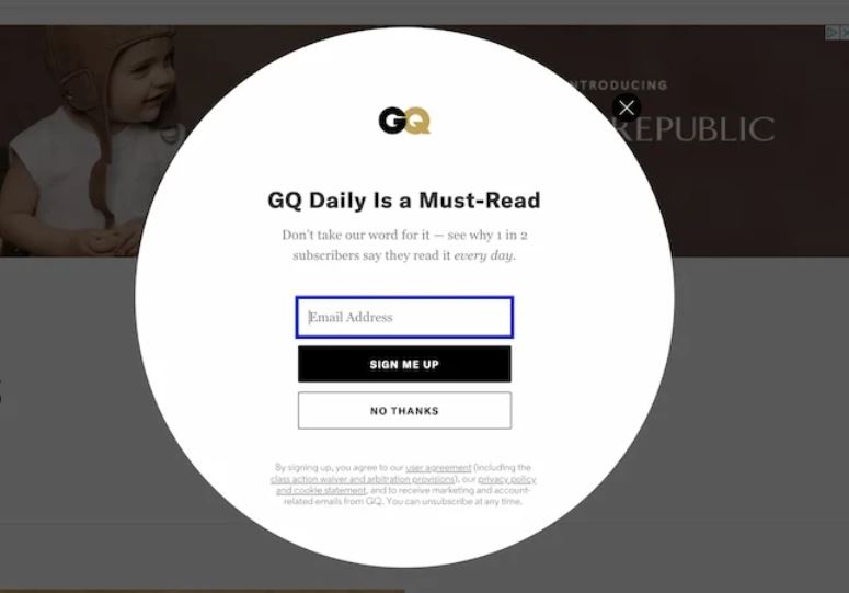
10. GQ
GQ users the path you take through their website to serve you a personalised offer based on your apparent interests. Clicking on Recommended and scanning the trends, for example, brought up this GQ Daily form. The colours on the form draw attention to the option they want you to select.
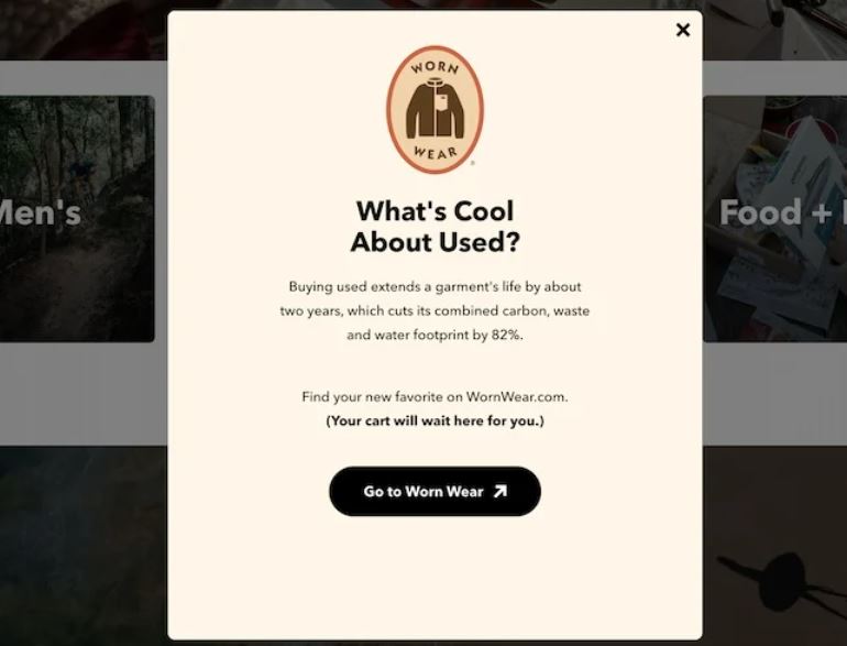
11. Patagonia
Why do exit intent pop-ups like this work? Because they don’t segment users. However, it enhances the user experience by providing quick access to information about sustainable clothing. After that, they point potential customers to a new and useful resource. When you return to the main site, the text also assures you that you can continue shopping in their online store.
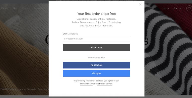
12. Everlane
Non-cookie visitors to Everlane receive free shipping. This is a different type of offer than a discount code, and it may be more important for certain types of customers. Choosing one offer over another is difficult, and the age of your target demographic should be taken into account when making your decision.
Tip: When deciding what offer to include in a pop-up, think about your visitors’ demographic.
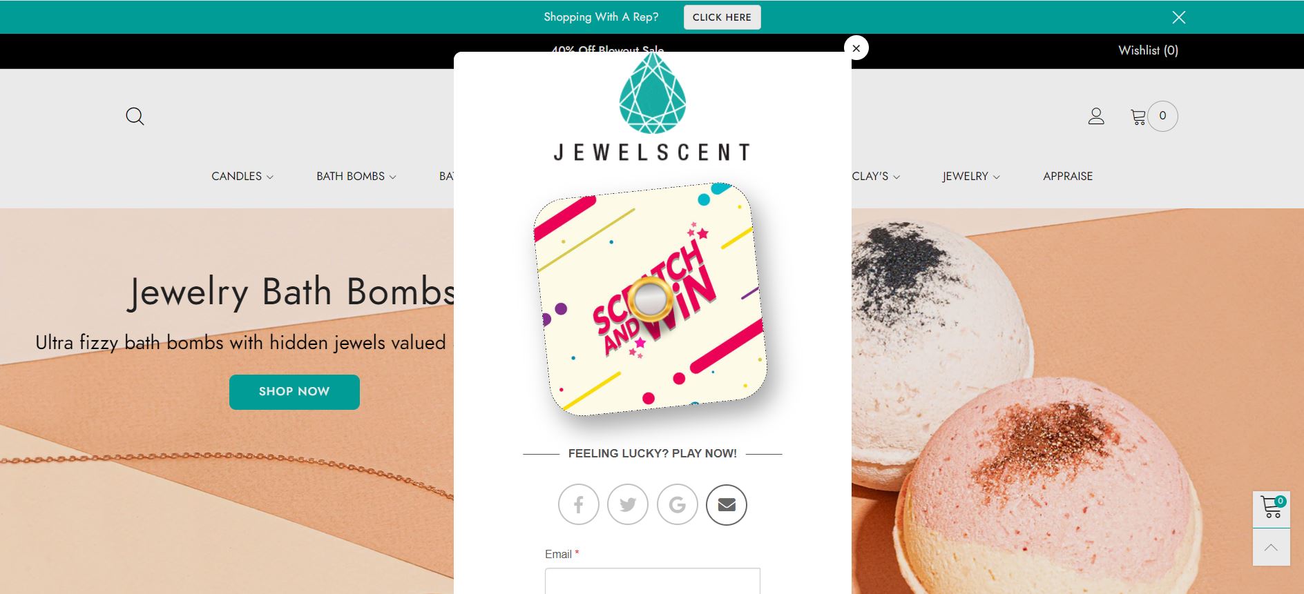
13. JewelScent
Because of the colours in the example, JewelScent offers content that feels bright and fun. The instructions are straightforward and to the point. It provides new customers with an unexpected short game.
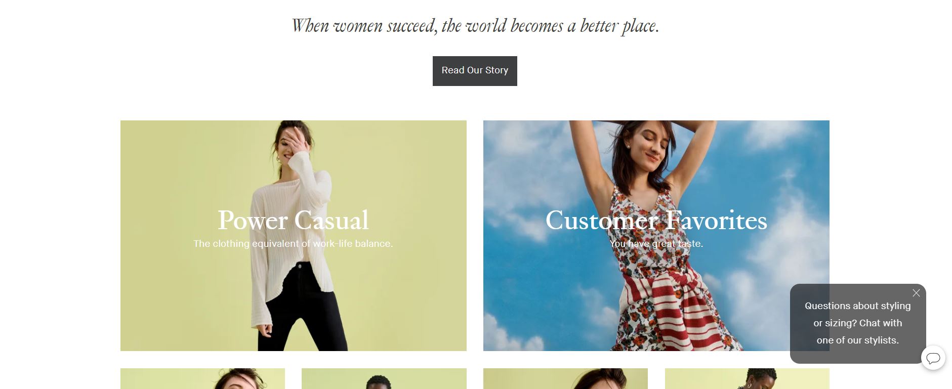
14. M.M.LaFleur
This chat example demonstrates how their stylists can assist you in selecting the appropriate size and style for you. They’re anticipating a common stumbling block to online shopping and showing you how to overcome it with this pop-up.
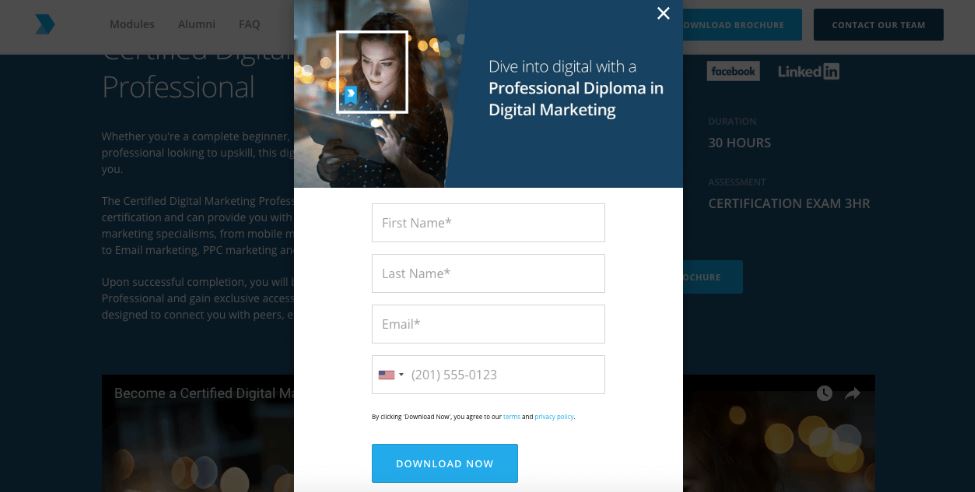
15. Digital Marketing Institute
This is a maniacal focus on getting email submissions and phone numbers (leads) to follow up with on the Digital Marketing Institute website. Their exit intent pop-up is unique in that it asks directly for something. Keep in mind: That this method may not work for all brands. However, if their customers are willing to provide the information, that is sufficient reason to collect it.
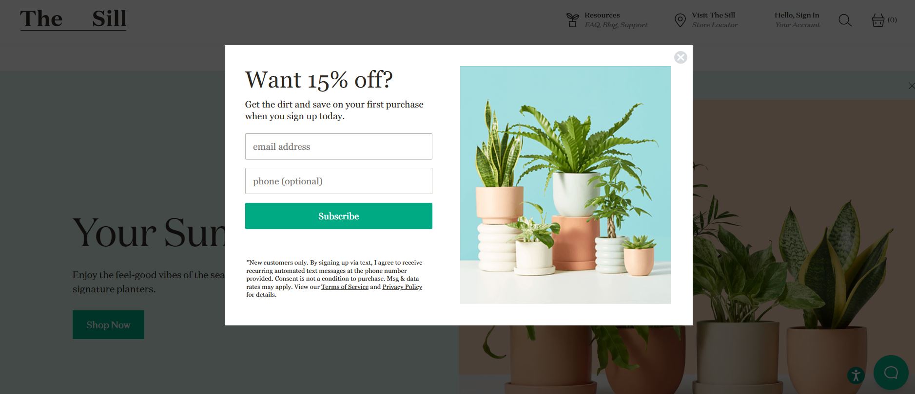
16. The Sill
Why does this pop-up work? This example is consistent with The Sill’s brand and products, as evidenced by the image of healthy plants and the offer to get the dirt. Along with a discount offer.
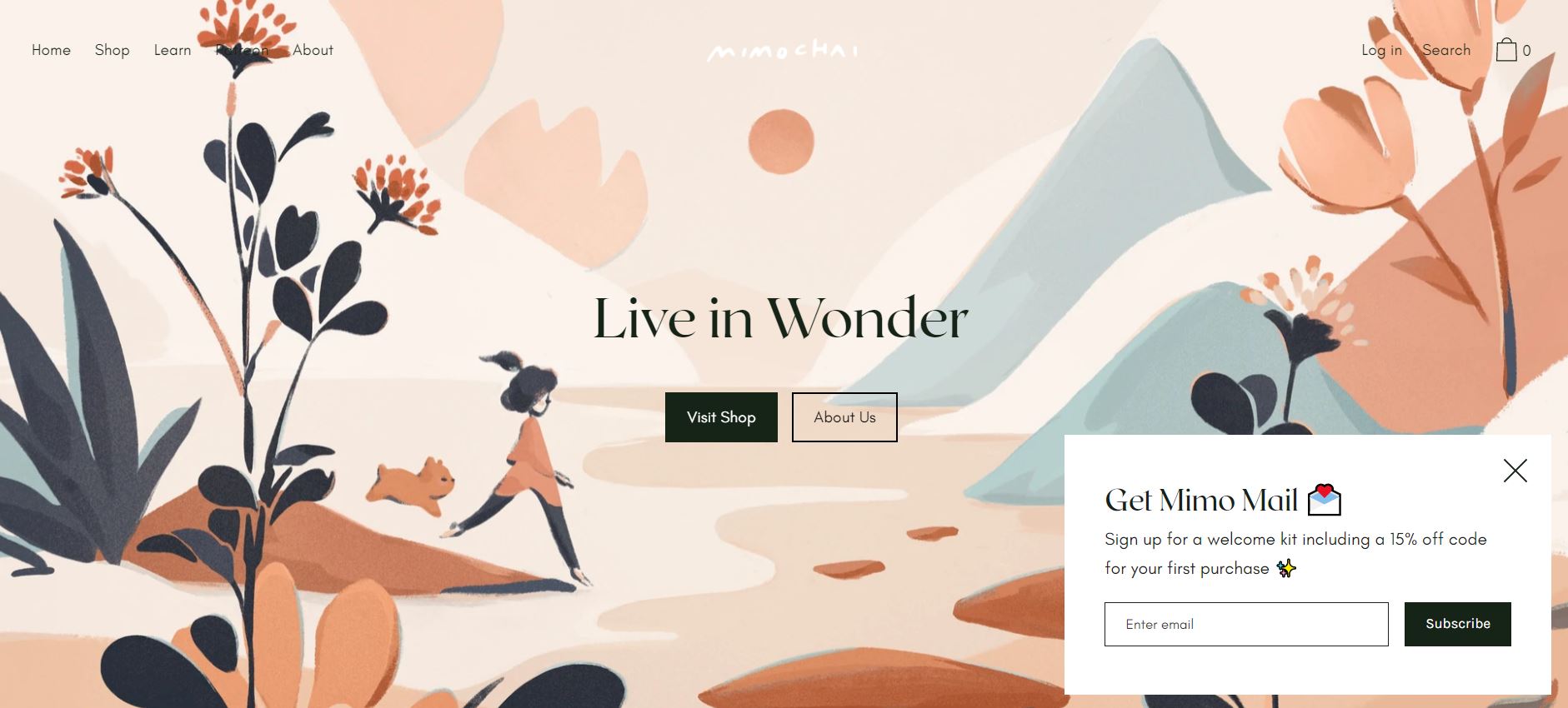
17. Mimochai
Why do pop-ups like this work so well? The heart on the envelope and other design details make this example feel like a pleasant surprise. The design stands out on the page without being distracting.
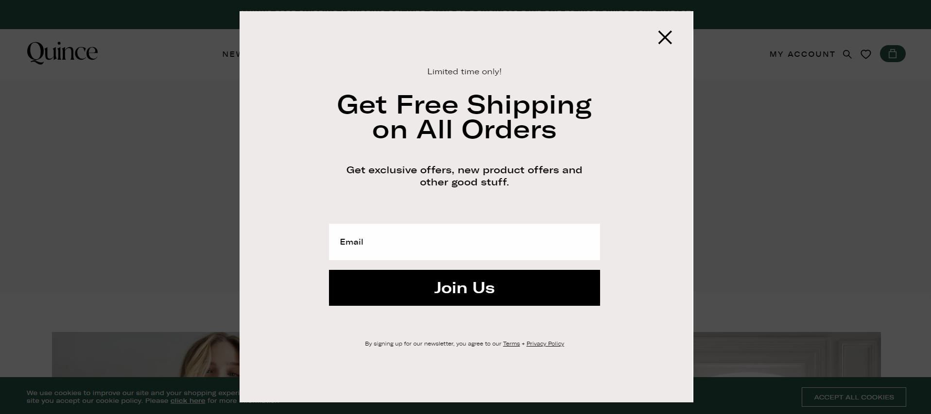
18. Quince
This pop-up is effective because it makes a strong point that you can’t overlook. Not just once, but every time you place an order, you’ll get free shipping. For online shoppers, free shipping is a valuable benefit. However, until it’s time to check out, you usually don’t see anything about shipping. As a result, sharing it in a pop-up is a good idea.
Exit intent pop-ups are a simple but effective lead generation and marketing strategy. You’ll be able to keep more readers on your website and increase conversions and revenue once you implement them.
If you’d like more advice on improving your website and capturing leads, contact us today to find out how we can help you grow your business.
Don’t forget: To see exactly how your website is performing compared to your competitors, try our free website grader tool.


