The colours you use on your website can have a massive impact on how visitors perceive your brand and interact with your content. The right colour scheme can make your website look more professional, inviting, and user-friendly. It can also help you to evoke certain emotions in your visitors, such as happiness, trust, or excitement.
In this article, we will discuss the best website colour schemes for different industries. We will also provide examples of popular colour schemes and tips for creating your own colour palette.
Level up your marketing with LOCALiQ
Subscribe to our monthly newsletter
In this blog, we will cover:
• What is colour theory and why is it important?
• The psychology of colour in design
• Colour palettes generator
• Why is a colour scheme important on a website?
• 10 examples of great website colour schemes
What is colour theory and why is it important?
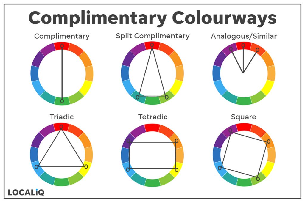
Colour theory is a collection of rules and guidelines that designers use. These designers use the colour wheel. The colour wheel consists of 12 colours:
- Three primary colours – These are red, yellow, and blue.
- Three secondary colours – These are orange, green and violet.
- Six tertiary colours – These are red-orange, yellow-orange, yellow-green, blue-green, blue-violet, and red-violet.
The oranges and yellows are warm colours, whereas the blues are seen as colder colours. Using the basic colour wheel, you can decide which colours work well with each other:
- Monochromatic – Uses only one colour but can use different shades of that colour.
- Complimentary – Uses 2 colours on the opposite end of the wheel.
- Split complementary – Uses one strong base colour and 2 secondary colours.
- Similar colours – Uses 3 colours next to each other on the wheel.
- Triadic colours – Creates a triangle using 3 colours evenly split on the wheel.
- Tetradic – Creates a rectangular shape using 4 colours on the wheel.
- Square – Creates a square using 4 colours equally around the wheel.
While many websites use a simplistic black and white, most will inject colour on their call-to-action buttons.
The psychology of colour in design
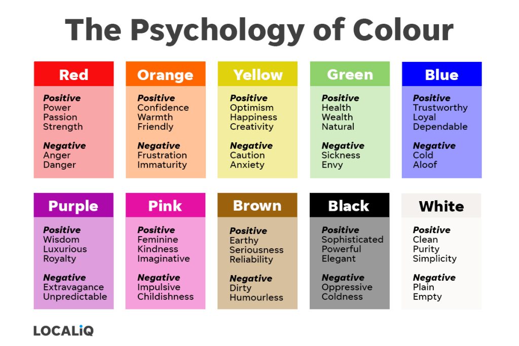
Colour psychology is the study of how certain colours can influence our mood and decision-making process. However, colour perception can change depending on where you are. In Western culture, red is seen as exciting, bold and in some instances danger, however, in China, red is seen as a colour for luck and food fortune. When looking at website colour psychology (and before you decide on what colours to choose), make sure you have a look at how they are perceived by cultures other than your own, especially if you are venturing into international markets.
All colours have positive and negative emotions associated with them.
Colour palettes generator
There are many website colour picker tools available on the market that allow you to create the perfect colour scheme for your website. These website colour picker tools can help you achieve the look and feel suitable for your brand.
1. Adobe Colour
A free tool from Adobe allows you to create your perfect colour palette. You can choose the colour wheel that allows you to pick from the colourways listed earlier or choose your own. The “Extract Theme” tool allows you to pick an image with colours you like, and the tool will choose a colourway for you consisting of 5 colours. Additionally, if you want to select a gradient, the “extract gradient allows you to create a gradient using up to 15 gradient stops.
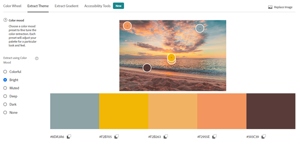
Image credit – Adobe Color (Original beach image -Pexels: Jess Loiterton)
The side menu allows you to also choose between assorted colour moods including colourful, and dark, and you can save the colour palettes you choose to find the perfect one for your website.
2. Canva
Canva is another free tool you can use to generate a beautiful colour palette. You can generate your own from an image or look at some of the colourways that are suggested by Canva.
Using Jess Loiterton’s image from Pexels again, Canva has given us this colour palette:
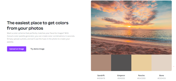
Image credit – Canva (Original beach image – Pexels: Jess Loiterton)
3. Coolors
Like the other mentioned tools, Coolors allows a user to generate their own colour palette as well as explore the most popular colour palettes. You can also use an image to generate a colour palette (see below).
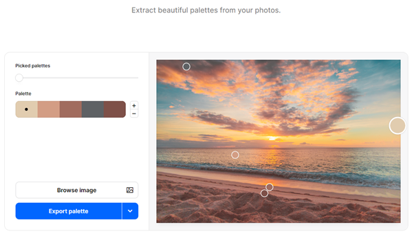
Image credit – Coolors (Original beach image -Pexels: Jess Loiterton)
Why is a colour scheme important on a website?
By understanding colour on a website, you can help improve your conversion rate. In website design, choosing a colour scheme is especially important.
- Accessibility compliance – You want to ensure that there is a stark contrast. You need to have a contrast of at least 4.5:1 to ensure the readability of any text against a background. Plenty of free contrast checkers are online to ensure your website is compliant.
- Colour aids brand recognition – If I showed you a bright red colour, what soft drink would you immediately think of?
- Colour evokes emotion – If, for example, your business website was all about yoga or healing and relaxation, you would expect to see muted tones of greens, greys and blues, not bright neon colours!
- Uniform web design improves usability – Using the same colour scheme and functionality throughout the website helps users navigate your website. For example, if you choose to have a different background colour than white, then this would ideally need repeating throughout the website.
- Colour helps with hierarchy – This helps a user identify what is most to least important on a website, helping them navigate easily through a page.
Now that we understand more about colour choices, let’s look at some website colour palettes.
Did you know we can help you design a website for your business?
10 Examples of great website colour schemes
Here we look at some real-world websites and the colour schemes they have chosen to convey their brand offering and messaging.
1. LOCALiQ
Blue is the most used colour in website design. That is because it signifies trust, but don’t just take our word that we are trustworthy…look at our reviews and business partnerships!

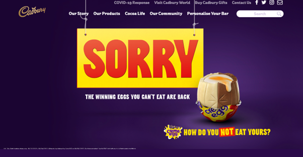
2. Cadburys
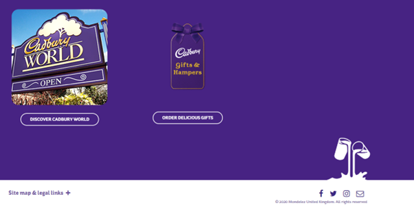
Perfectly combining the gold and purple, you can instantly tell you are on a Cadbury’s website with their colour scheme! We also love the “glass and a half of milk” at the bottom directing your eye to their social channels which may otherwise have been missed!
3. Victoria’s Secret
A brand that specialises in femininity and women’s lingerie, so it is no surprise it opted for feminine pink. Note how they used pink to guide you to the clearance section as well as using a bright and bold pink CTA button asking you to subscribe to their newsletter.


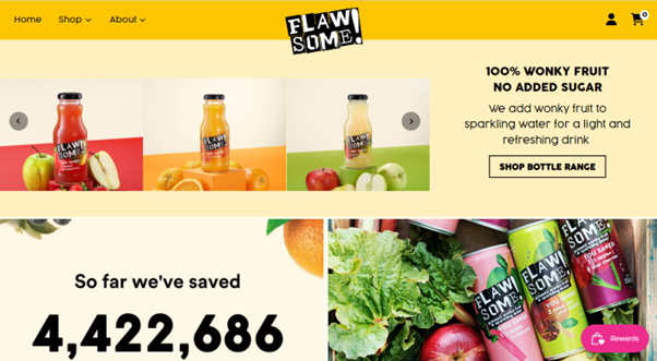
4. Flawsome Drinks
Flawsome’s website uses monochromatic shades of yellow-orange. These colours are focused on friendly and optimistic emotions, which fits in well with its brand ethos of saving wonky fruit & veg from going to waste. The accent colours used in the bottle imagery grab attention; your attention has been drawn to items for sale.
5. Coca-Cola
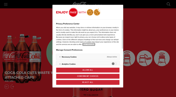
From the moment you enter Coca-Cola’s website, the branding is evident; From the logo and colour used on their cookie policy to their actual website. If you click on one of their signature drinks (original, diet or zero), the website’s branding changes to reflect that.
6. Pugh’s Garden Village
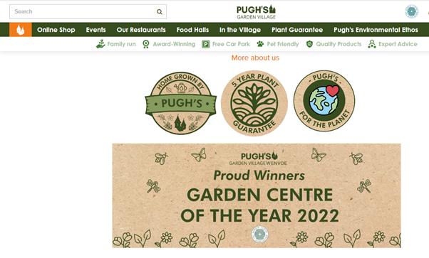
This website colour scheme was incorporated to significant effect, using browns and greens; colours that instantly remind us of nature.
7. Netflix
Sometimes you can break the rules and reverse the effect. Netflix has used a black background with white text. It is effective as the white writing pops out. Netflix have even made the CTA’s in the same colour as its logo

8. PureGym
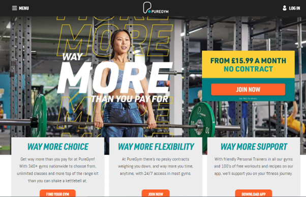
This website uses a few more colours to grab your attention. Bright tones of yellow, aqua, and orange work to create an upbeat and energetic feel.
9. David Lloyd Gym
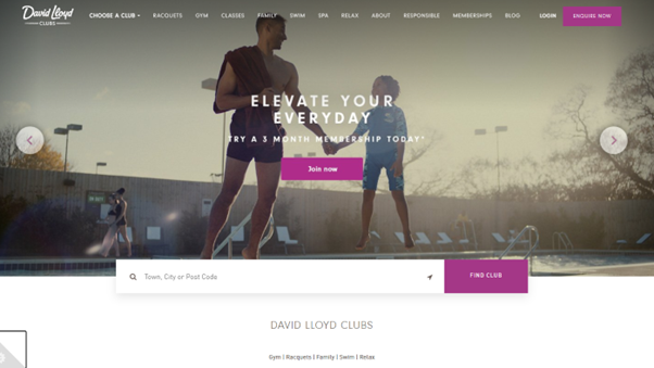
Compare the differences between PureGym and David Lloyd. Both are gyms, PureGym is open to all whereas, David Lloyd is going for a more luxurious and exclusive theme.
10. Toys R Us
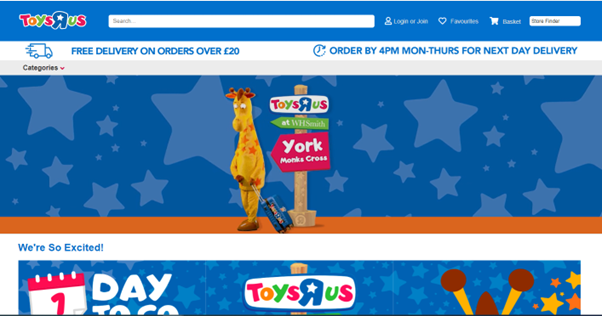
Toys R Us uses a lot of blue on its website, but its logo and associated images use lots of bright colours to captivate an audience.
To surmise, the best website colour schemes are those that are both visually appealing and are effective in achieving your website’s goals. By considering your brand identity, target audience, and website’s purpose when choosing your colour scheme, you can create a website that is both beautiful and functional.
Remember to follow our top 3 tips for choosing the best website colour schemes:
- Use a colour wheel to help you choose complementary colours – A colour wheel is a helpful tool for understanding how assorted colours interact with each other.
- Use a colour palette generator to create a cohesive colour scheme – A colour palette generator can help you to choose colours that work well together.
- Get feedback from others – Once you have chosen a colour scheme, ask friends, family, or colleagues for their feedback.
By following these tips, you can choose the best website colour schemes for your brand and your audience. This will help you create a visually appealing, user-friendly, and effective website.
If you’re still not sure where to start, then LOCALiQ can help you design your website; why not have a look at some of the websites we have already completed for our clients?
Additionally, we also offer a monthly newsletter packed full of helpful tips, tricks, and industry news. You can sign up today.


